If you have read any of Taleb's books you will be aware that stock returns have "fat tails" and that there are "black swan" events which make investing much more dangerous than simple models would suggest. Talk of "black swans" seems to suggest that these unlikely events are very rare, but in fact lesser "dark grey" swans are occurring all the time. In this post I hope to use graphs to make this effect easier to appreciate.
What do fat tails look like in a real example?
Let's have a look at the price action of Rio Tinto (LON:RIO) from 2007 until now. (Right-click: view image to see a bigger version)
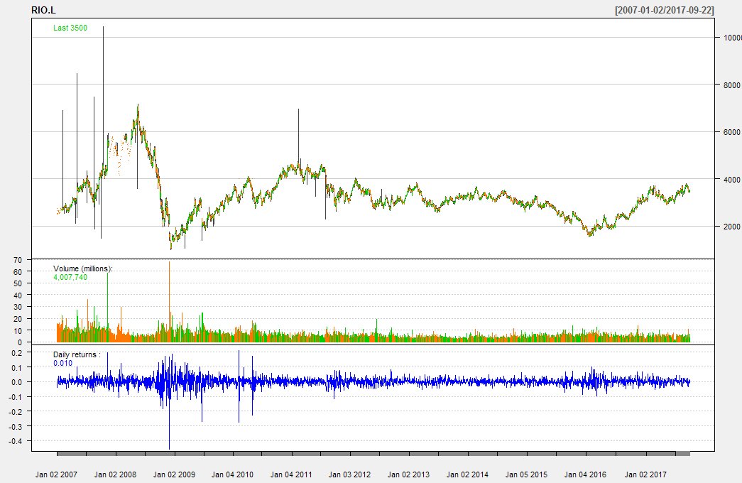
Underneath the price chart I have computed the "daily returns" - that is to say the (price today)/(price yesterday) for each day. For the human eye the normal price chart is much easier to understand than the returns chart which just looks like noise.
If you look at this chart of returns (the blue "noise") you can see that somewhere around November 2008 there was a very big fall (over -40%) in a single day, but mostly the daily moves are very much less.
It's impossible to really see any other patterns from the time-series plot, so let's look at these returns as a histogram instead.
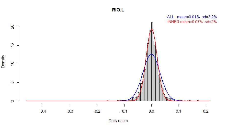
We no longer care about the order in time that they occurred - just how often moves of a certain size happened. That one massive fall has skewed the histogram across to the right. But mostly the returns form the familiar shape of a bell curve similar to a Gaussian (Normal) distribution. It is natural to assume the distribution is basically close to Gaussian, with any deviation due to simple "experimental error" but is this true? (Hint: no - as we shall see!)
Superimposed on the histogram are two attempts to fit a Gaussian (Normal) distribution. You can see from the coloured labels in the top right the values of mean and standard deviation (sd) that were used to draw these two curves. The blue curve is based on the values for mean and standard deviation computed using the standard formulae. The red curve however was computed using a different technique which we will discuss in more…