Recent UK IPOs have proved to be a rich seam for canny investors. The following three tables analyse UK IPOs over the previous 12 months to 30/10/2015. The data excludes investment trusts and REITS.
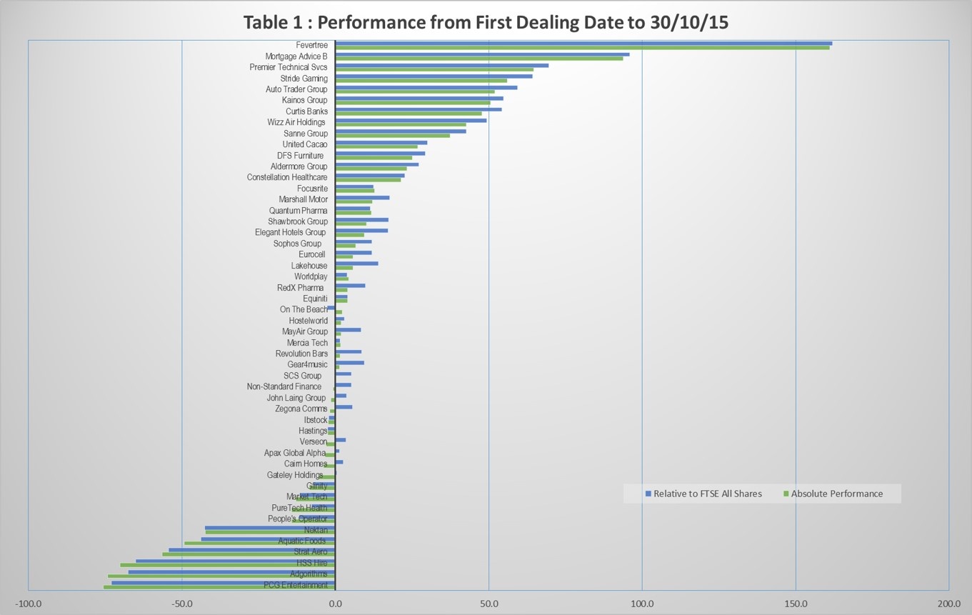
The first table shows performance from first dealing dates to 30/10/15, both for absolute gains/losses and relative to the FTSE All Shares Index.
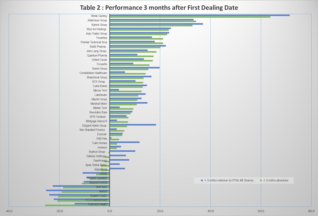
The second table measures performance 3 months following the first dealing dates.
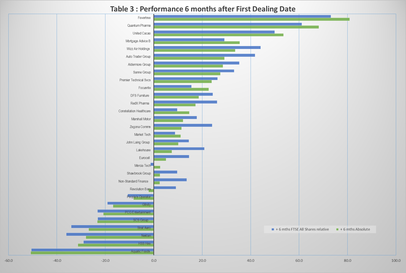
The final table measures performance 6 months following the first dealing dates.
Conclusions
- The average absolute gain was 7.2% based on table 1 assumptions.
- An interesting finding was that the Private Equity IPOs were more profitable than the others; 8.2% vs 4.9% on table 1 basis. This finding questions the general belief that Private Equity IPOs work against the interests of retail and institutional buyers.
The interesting question is, are there factors or characteristics common to the winners and similarly for the losers. This is the question I will addressing next. Of course it may well be that any correlation doesn't actually exist.
[ Note 25/11/15 the tables below have been revised as some data was missing from the previous charts ]
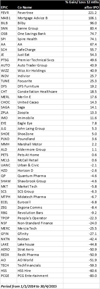
Update on 4/5/2016
As I now have more data since my original note, below is a tabulation of all IPOs in the period 1/1/2014 to 30/4/2015, showing their performance precisely 12 months after the first dealing date (closing price).
This analysis again goes against the generally accepted belief that IPOs are bad. The simple average is +10.8% over all stocks, and even if one excludes Fevertree as an outlier, the average comes to +6.6%
Investors can do a lot better than the average by judiciously avoiding IPOs of companies which are not making a profit, or heavily burdened with debt, or have little or no financial history.


.png)