When the Bank of England first began publishing their “fan charts” I immediately became a fan of the fan charts. They bring to life the uncertainty which is implicit in most forecasts.
Sadly, there is a lack of similar visual tools for stock market investors, which means those who are not of they buy-and-hold variety are left with little to go on, other than perhaps the market’s current PE, the dividend yield, and the chicken-entrail readings of analysts.
The rise of CAPE
In recent years the snappily titled CAPE, or cyclically adjusted PE, has become popular, probably because it’s a giant leap in the right direction.
By comparing the market’s current CAPE to its long-run average, investors can at least begin to have an idea of whether or not the market is too hot, too cold, or just right, as goldilocks would say.
That’s possible because CAPE has proven to be mean reverting. In the long-run the FTSE 100?s CAPE, or that of any sufficiently diversified index, tends to move around its long-run average. At least that’s the story of the past century or so.
As well as being mean reverting, the FTSE 100?s CAPE hasn’t moved very far from its average, which is about 16, going perhaps twice as high and half as low in extreme booms and busts (the S&P 500 did go almost three times as high in the dot com bubble, but on this side of the pond our markets maintained somewhat more decorum).
There certainly doesn’t appear to be any evidence that CAPE is something that can grow indefinitely, or is something that changes by huge amounts, which means the FTSE 100 is unlikely to reach 100,000, or 100, any time soon.
Although there is no magic bullet, CAPE is a sensible way to give yourself a ballpark estimate of where the market is in terms of the range of valuations it’s likely to reach.
The chart below shows a set of FTSE 100 valuation bands for the past 25 years, covering a range from around half to double the long run average.
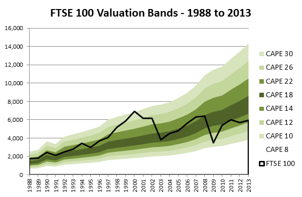
A few points to note :
- The rise from left to right of the valuation bands. This occurs because of two things – inflation, and the real growth of companies which make up the stock market.
- The valuation bands get wider to the right because they…