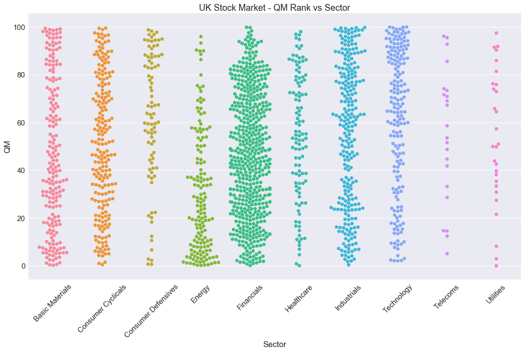
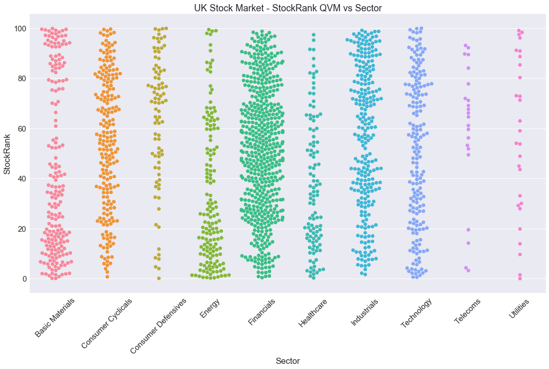
One of the things I've always been aware of is that the StockRanks do tend to favour some sectors more than others. It's partly by their nature - the tendency to favour 'good, cheap, improving' shares means that more premium sectors (such as Healthcare) or speculative sectors (e.g. Oil E&P) will struggle to reach the heady heights of achieving a "99" StockRank. But I've never had a complete understanding of the spread across all sectors.
I've been recently brushing up on my data visualisation skills, so I thought I'd share a couple of interesting graphics on this topic. The following are called 'swarm plots' - they visualise all the shares on the UK Stock Market as dots, with the StockRank on the vertical axis, and the Sector on the horizontal.
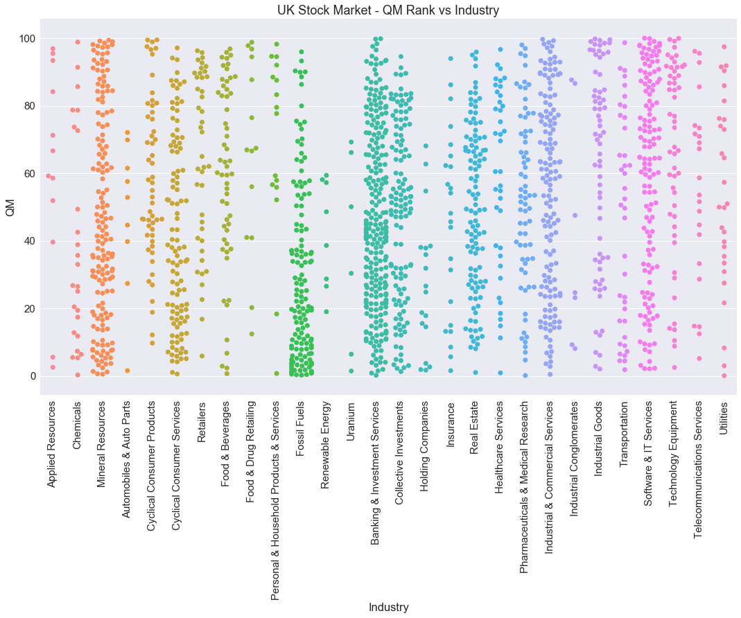
The next chart shows the same data, but separated by "Business Sectors" - these are actually a level of the sector hierarchy we don't publish on the site, but they map to the above sectors sequentially so you can pretty much map them visually with the above chart.
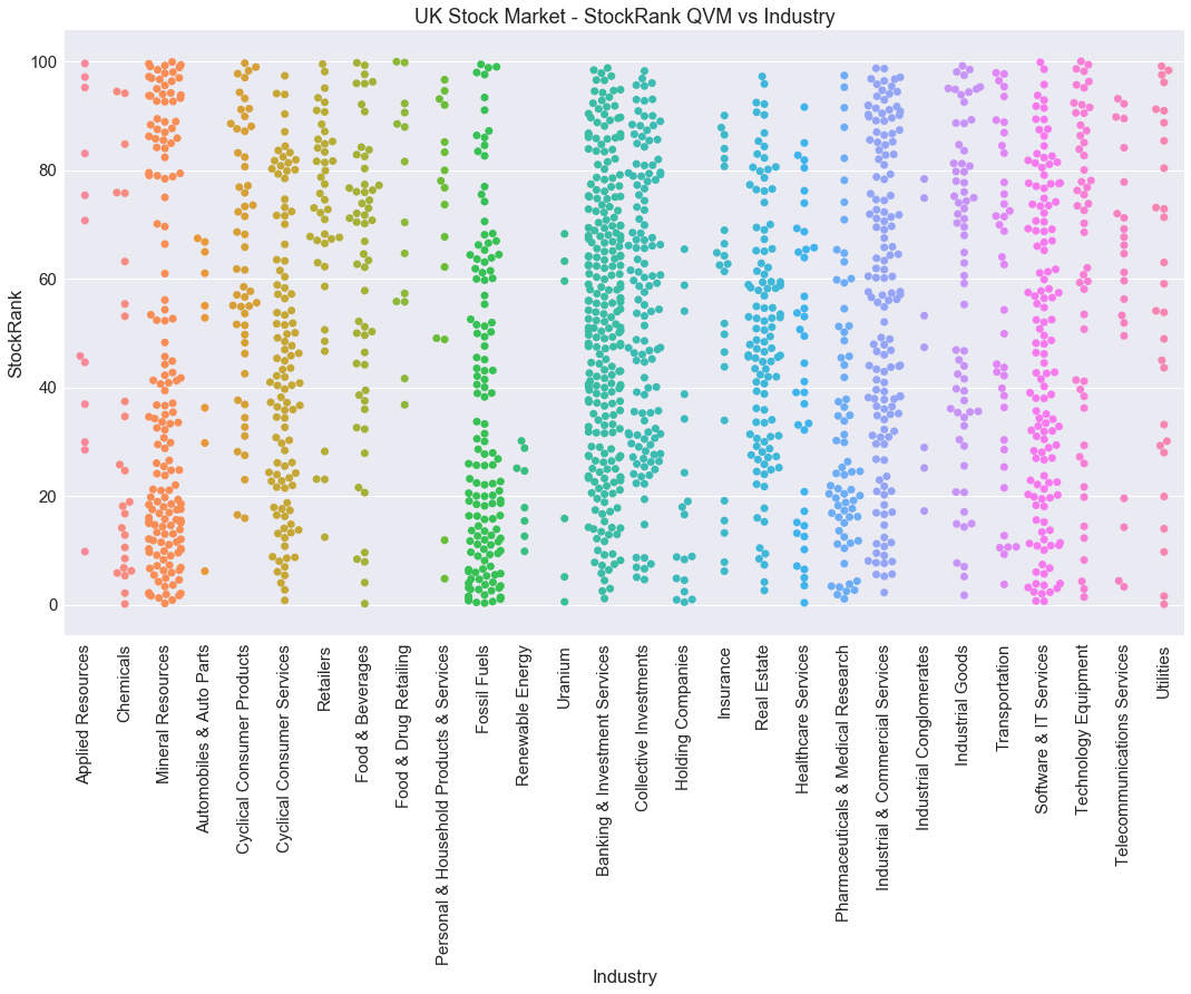
You may struggle to see these images clearly - but you can normally 'right click' the image and choose 'Open Image in New Tab' - you'll see it in a lot more detail.
I can easily create some observations and insights from the above data... but I thought perhaps that pleasure could be all yours.
Please do add your comments below.