I was doing my research into Clinigen (LON:CLIN) after the price drop last week, and started by looking at the Annual Report for the FY20 which covered the period upto June 2020.
I took a position after seeing comments that suggest that there is nothing structural about the Proleukin drop, and it does ebb and flow with hospital capacity, so their recent RNS's in Feb and June are consistent with their comments in the Annual Report, and consistent with CoVID ebbs and flows seen over the past 12 months in my view.
I saw the price drop as oversold especially in the light of the very fast growth of the services division. Hopefully Slater Investments saw the same thing when they took a considerably larger position than I did.
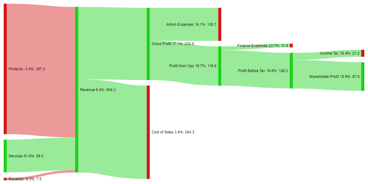
For what it's worth, I wanted to share a some of my research output which is a sankey diagram based on the Annual Report Income Statement (please bear in mind that this is upto June 2020 only)
I colour coded it to to be green on all nodes that have grown since FY19, and red where shrunk (or costs have grown), also included are my % deltas. It gives a good snapshot of how the business is doing, and it is a method I use before researching deeper into the business, it also helps as I reference back to the company during my later portfolio reviews.
If anyone has any further ideas on how to represent this or other financial statements visually I would be glad to hear them.
Any comments or criticisms, or further thoughts on the company is welcome also.
Take care,
S.
(you can right click and open in a new tab to expand the diagram out)