Alan Hull is a renowned technical analyst within the Australian Market. He has educated thousands of investors on how to apply technical analysis within their overall strategy. In this special monthly series, Alan has agreed to share his Technical Analysis tutorials with Stockopedia members. To learn more about Alan you can read his profile here. Or visit his website alanhull.com.au
Introduction to charts
Technical analysis or charting can be split into 2 schools. The oldest form of analysis is pattern recognition which is based upon human behaviour and history repeating itself. The newer school of charting is based upon probability and statistics. With mathematical and graphical analysis a chartist can calculate the most probable direction of price movement. These 2 forms of analysis overlap each other and most chartists use both. All charts are based on three elements; price, volume and time.
Different types of charts
There are many different types of charts in use throughout the world. All of the following examples are in common use today. The type of chart used is not a right or wrong decision but rather a question of personal choice. Different types of charts have their own strengths and weaknesses but it is never a good idea to use a type of chart that you do not feel comfortable with or confident in using.
What we are looking at when we study a price chart is the change in price over a given period of time. Hence the vertical scale on any price chart is the price of the instrument in question, while the horizontal scale is time. The following chart of BHP Billiton showing slightly over 12 months of weekly price activity is a typical example of the sort of chart you would see in a newspaper or magazine and is the simplest form of price chart…
Line-on-close weekly price chart of BHP Billiton
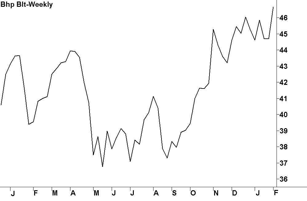
This chart would technically be referred to as a weekly line-on-close chart and is created by drawing a line connecting the weekly closing prices of BHP (ASX:BHP) during the period shown. The closing price is considered to be the most important piece of price information but there is more to the story on price than just the closing price. There is in fact four individual bits of…