US sector rotation out of Techs in the air?
Within stock markets, and the US in particular, there looks to be some hint of rotation finally away from the mega-cap technology leaders towards the rest of the stock market.
US Fang stocks take a breather, allowing the average US stock to regain a little ground
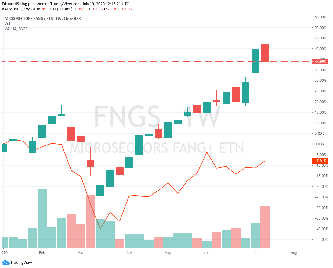
But at +39% for the year, the FANGs are still a massive winner for holders of US tech stocks and large-cap stock indices, with in contrast the average US stock (measured by the VALUA Valueline arithmetic index) still down 8% for the year to date.
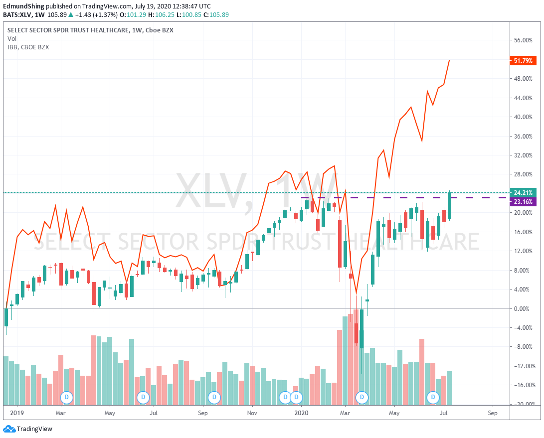
Within US sectors, while Tech may have had a small pullback from recent euphoric highs, Health care (candles below) and Biotech (orange line) in particular continue to move to new long-term highs...
Worldwide Healthcare Trust (LON:WWH) and Biotech Growth Trust (LON:BIOG) remain two of my favourite UK investment trusts giving exposure to these sectors.
XLV Health care and IBB Biotech continue to lead in the US
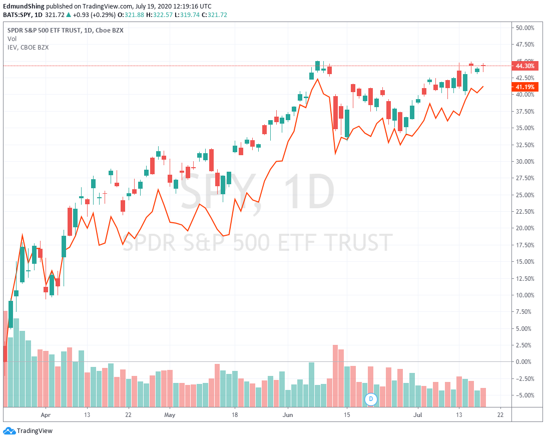
What is perhaps more surprising (at least to me) is the fact that, despite the huge performance by tech mega-caps dragging up the overall S&P 500 index, that European stocks overall (represented by the IEV iShares Europe ETF - the orange line below) have kept up pretty well since the March 23 low, rebounding over 41% to the S&P's 44%.
European stocks keep pace with the US in spite of the supercharged Tech rally
Precious Metals Breakout! Not just gold, but silver too. And watch palladium
Gold has held well this week above the psychologically important $1800 level, and looks primed now to challenge the $1900 2011 high.
But what is perhaps more interesting are the moves that we see in other precious metals, notable Silver and Palladium.
Silver has been the poor relation of gold for many a year now, with silver at $19.32 still far far away from its near-$50/oz high back in 2011...
This is most simply illustrated with the following chart of the gold/silver price ratio over the long-term, hitting a recent peak of 120 early this year (i.e. you would have needed 120 ounces of silver to buy 1 ounce of gold!), but now declining…