Hi All,
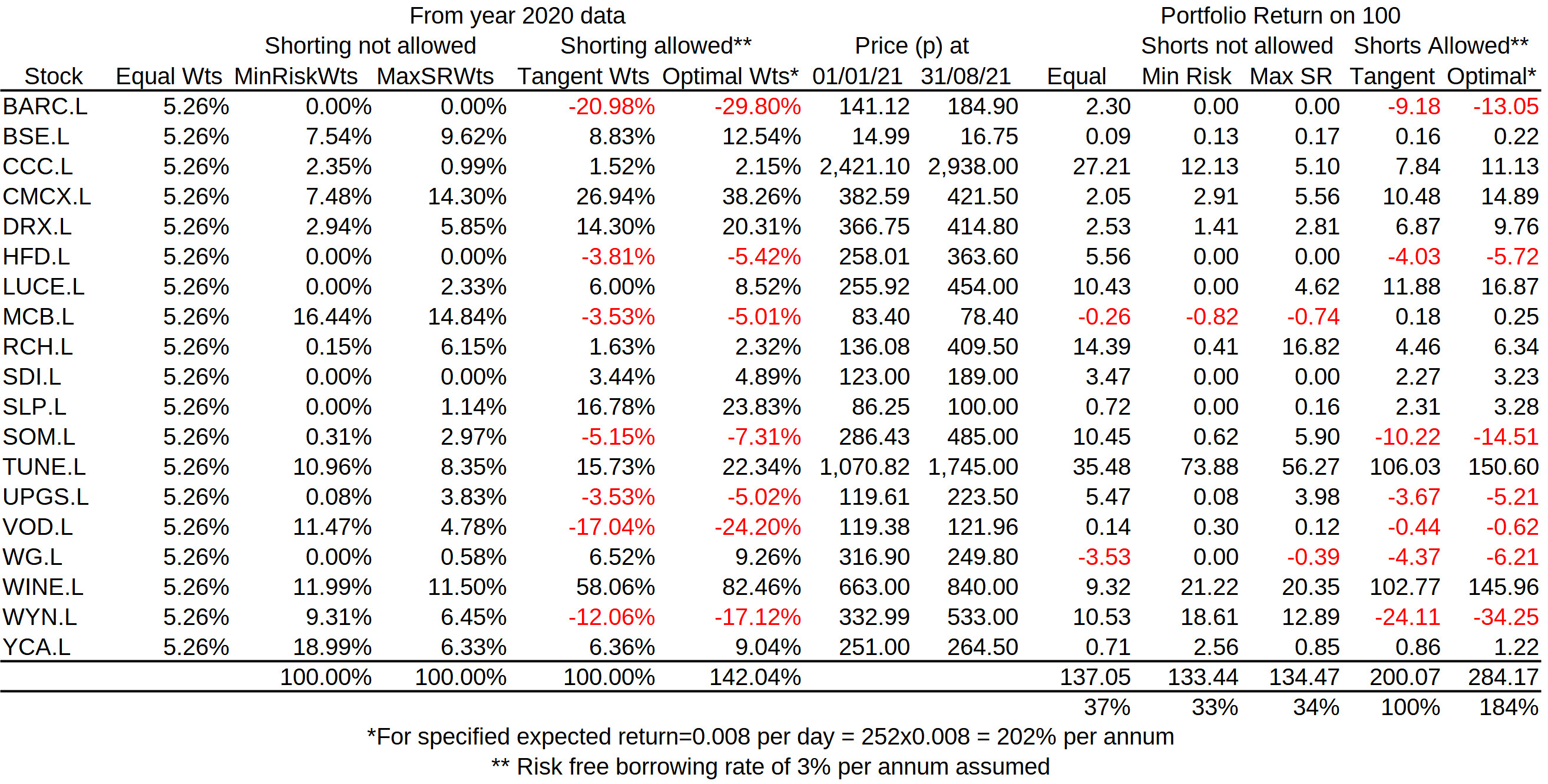
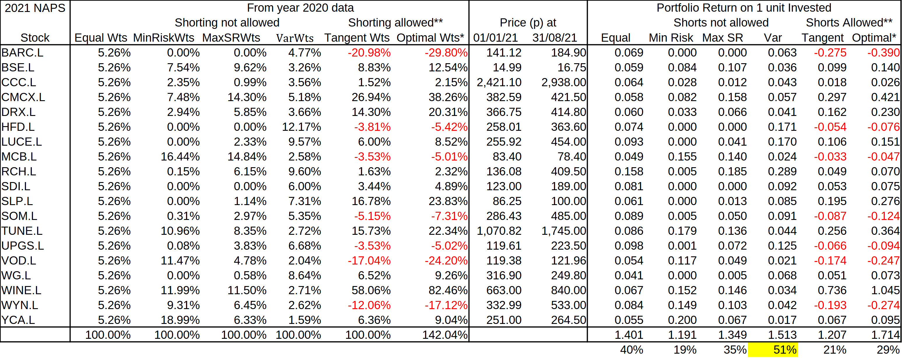
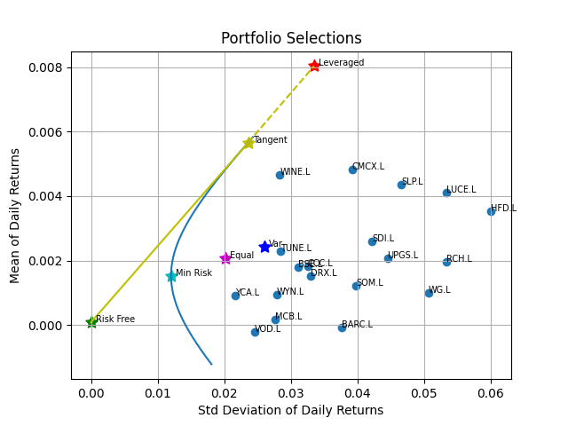
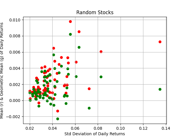
I selected all stocks (except for ERGO, where there was a data problem) in Stockopedia's 2021 NAPS and using data for the previous calendar year, performed a portfolio optimization.
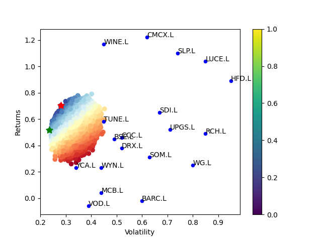
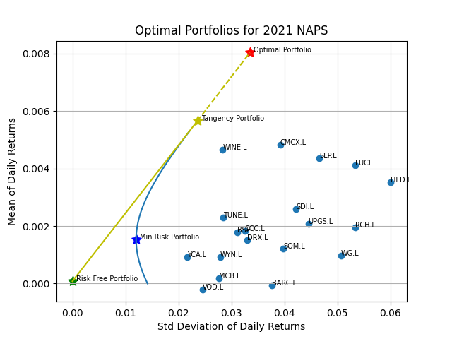
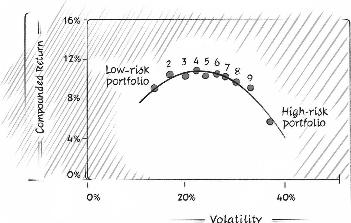
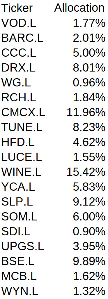
The resulting plot shows the position of each stock on a Returns-Volatility diagram. The red and green stars are on the efficient frontier that correspond to a maximum Sharpe Ratio and minimum volatility, respectively. The weightings corresponding to the maximum Sharpe Ratio (and thus, Optimal Portfolio) are
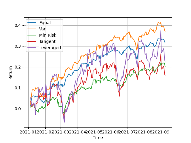
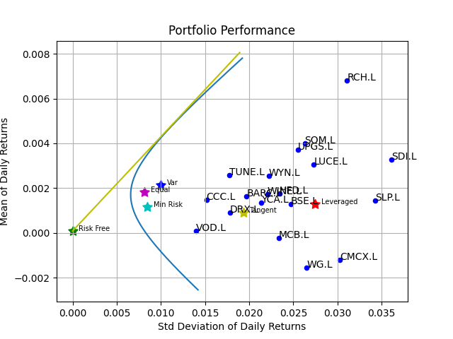
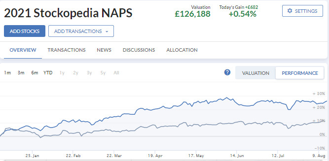
Purchases were made on 1 Jan 2021 according the the above allocation and the YTD results compared to purchases made with equal weighting. The results were:
2021 YTD Returns:
Optimal Allocation: 26.2%
Equal Weight Allocation: 41.6%
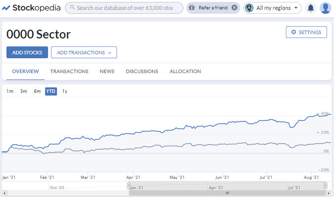
It comes to me as a surprise how much less the 'optimal' allocation return is compared to the equal weight allocation. Perhaps, the 2020 pandemic year data used may have thrown things out a little. Perhaps, also, the optimal portfolio approach is more suited to the allocation of more diverse assets, including bonds for example, rather than just stocks. Comments welcome!