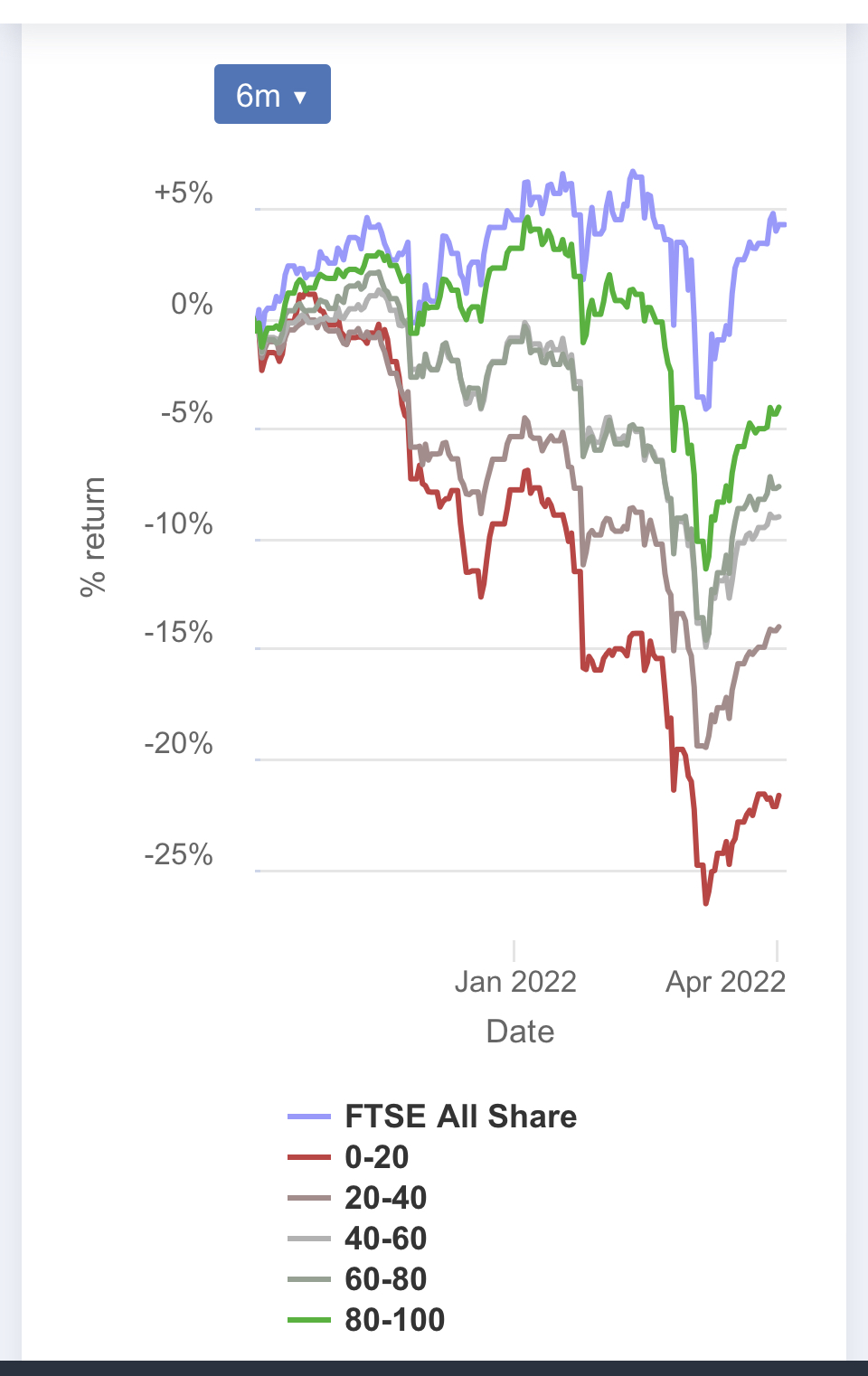
This is a chart of UK stocks’ performance over the last six months, divided into Stocko rank quintiles. The FTSE all-share index (purple line) has done better than ALL theshare groups of which it is composed. How can that be???
I’m quite perplexed!