Not to be confused with RSI which I can readily display on stockopedia charts. But keen to be able to display the Relative Strength (RS) Rank curve on a chart for UK stocks
The Relative Strength (RS) Rank as I understand it gauges a stock's performance vs. a chosen index. A rising line means the stock is outperforming that index.
Does anyone display this curve, if so what site or software are they using to do this?
Thanks


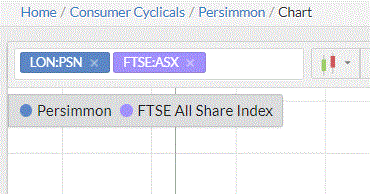
Follow this http://stockopedia.com/charts/... for an example of what I think you want. You get this by typing in the box next to the share you have selected.
Personally, I don't use it but I generally require a positive relative strength over 3m+ versus the sector and an absolute strength >0, using filters, so showing it on the chart would be redundant.


