Last week we looked at some of the basic rules you need to know in technical analysis. This week we start our focus on the actual tools of the trade, beginning with a look at Line Charts and Bar Charts. Charts are like maps to navigate. The analyst has to pilot his or her way through the data, translate the stories and come up with a forecast as to the future journey they think any given asset will take. One chart can tell a thousand stories.
In this and the next four blogs, I am going to cover the rudiments of what I call the 'common core' suite of charts. These include: Line & Bar charts, Candlesticks, Point and Figure, Equivolume and Market Profile. The more exotic sounding charts: Heikin Ashi, Renko, 3 Line and Kagi will be covered later in the series. We start though by looking at two forms of chart: the Line Chart and the Bar Chart. Both have their own pro's and cons but when diving into technical analysis, these are a great place to start.
Basic chart set up
For both these styles of chart, prices can be represented either linearly or logarithmically. The X axis normally represents the time you have selected (in whatever increments) and the Y axis the price. In regards time, it can be represented from as little as a minute of price action to a month. I like to bucket these times into two distinct categories: 1. Short term / Intraday time frames such as 1min, 5min, 15min, 30min, 1hr, 4hr. 2. Longer term/ non-intraday time series e.g. Daily, Weekly, Monthly.
Line Charts
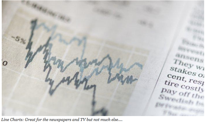
The line chart is probably the most simple and least effective charting method from the point of view of the technical analyst. Why? Because it doesn't really tell you much. What is it? It is a plotted line of the closing prices of a particular asset. Added together they create a 'line'. The line chart is a great tool to present to management or anyone who doesn't understand technical analysis, so that you can quickly show to that user how the current price of an asset has been performing in a clear visual manner. It is often the case that you'll see charts like this on the news or inside the finance pages of your national newspaper. They are…