Last week in Part 5, we looked at Point and Figure charts. This week, we look at one of the relatively newer styles of charting methods that is yet to catch on in a more global sense: Equivolume. The rapid advancement in technical analysis and charting package technology over the last half of the 20th century, has allowed for many more innovative technical analysis solutions to come to the fore. One such method is that of Equivolume.
What is Equivolume?
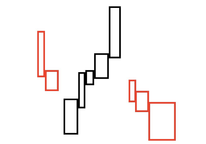
Equivolume is essential reading for the MSTA syllabus, but yet, not many people have heard of it or use it. It is quite simple in its logic and application and provides the user with another interpretation as to how to read the markets. It basically adds price and volume together into one bar. These bars are known as a ‘box’.
Equivolume was developed by Richard Arms, who is better known for the Arms Index, along with many other innovative technical analysis solutions.
Notice on the generated example below, that there are no candle wicks (don’t get these charts confused with candlestick charts), and the width of each ‘bar’ varies according to changes in volume:
Interpretation
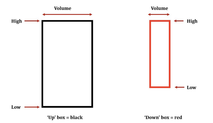
The box:
The width of the box represents the volume traded on that particular period – whether that be a 1 minute, 1 hour or 1 day bar, for example.
The wider the box, then the greater the volume in that said period.
By default, when the close is above the previous close, the box closes ‘black’.
By default, when the close is below the prior close, then the box closes ‘red’.
In detail
Equivolume – a simple idea but powerful in its visualisation of a given market.
Equivolume Chart vs the Bar Chart
When comparing the two different types of chart, you can instantly see the advantages of equivolume. Visually, it is much quicker and clearer to see how volume has interacted with price and it has the added advantage that it is all on the one chart – you don’t have to glance below the price data to try and ‘line up’ volume to the price activity. The major downside to the equivolume chart is that it makes traditional pattern drawing analysis very difficult.
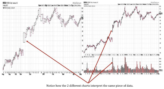
Example from StockCharts.Com charting package, using US Stock: Nvidia Inc