How to read a Stockopedia StockReport™
At the heart of Stockopedia are over 2300 Stock Reports covering every company listed on the London Stock Exchange Main Market, AIM and PLUS markets. These pages have been designed from the ground up to give the modern investor the essential information he needs to make his decisions.
Many investment publications swamp investors with pages of information without any regard to presentation. There is so much information that can be published that many publishers do not know when to say enough! Our principle has been to keep things simple but effective, using only the most powerful ratios and indicators in a standardised way so that all stocks can be compared like for like. A lot of thought has gone into the make up of the Stock Reports, and the reasoning is explained here.
Our stock reports focus on metrics that independent research has shown to have a quantifiable impact on future stock returns, while ignoring metrics that don't. We have provided references for further reading below. Feel free to give us any feedback on the reports.
You can watch a video introduction to the Stock Reports here.
StockRanks™
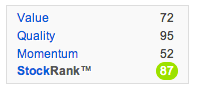
Every company on Stockopedia is graded for its Quality, Value and Momentum - the primary driving forces behind future stock returns. Much of our research goes into compiling a bespoke library of ratios and metrics that actually pay off in the stock market and it finds its fruition in this proprietary set of rankings.
Every stock is ranked from zero (worst) to 100 (best) across each of these composite ranks. They are then combined into an overall Stockopedia StockRank™ that has performed extremely well in backtests, especially amongst smaller and mid-cap stocks. You can read up in detail about the StockRanks here.
TrafficLights™
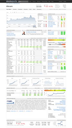
One of the first things you will notice about a Stockopedia Stock Report is that it is highly visual in nature; using color, charts and graphical indicators to highlight the important and changing variables for stock pickers. A key component of the page is the extensive use of what we call the TrafficLights™ which come in two formats, horizontal meters and spots.

The horizontal meters show the rank of each ratio (e.g. PE Ratio) versus its sector (s) or the market (m) as a whole with colour coding used to indicate in which quintile (20% band) the stock has been ranked; from green (ranked in the top 20%) through to red (bottom 20%). At a glance, an investor can judge the relative merits of a stock across different value, growth and momentum criteria by analysing the colour fingerprint of a stock page.
The spots are individually calibrated to colour from green to red for the indicator in question depending on whether the indicator is favourable or not for the stock.
Quote & Valuation
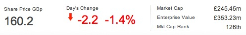
The simplest things matter, and we aren't talking about the price quote.
Most websites show the market capitalisation as a proxy for the size of a company with a complete disregard to how much money the company has borrowed. We publish the Enterprise Value of each firm, adding the company's net debt to its market cap to provide a more accurate picture of a company's size. At a glance you can tell if a company...
- Has net cash (an EV less than its Mkt Cap),
- Is highly levered (EV far greater than Mkt Cap),
- Or is being sold for less than the cash in their accounts (a negative EV)
Another indicator of the size of a company is the Mkt Cap Rank which shows how large it is compared to the rest of the Market.
Momentum
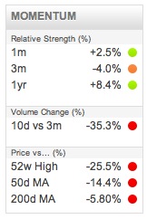
Ever since the 1980s, when the now infamous Turtle Traders beat the market with simple breakout based strategies, momentum investing has been shown to be a profitable strategy in many markets. We provide a set of the most simple but powerful indicators with associated TrafficLights™ to show their meaning.
- Relative strength. Relative Strength is defined as the share price performance versus the market index. Stocks with 3 to 12 month relative strength (vs. the market) above zero have been shown in many studies1 to continue their outperformance by several percent over the following year. 1 month relative strength has actually been shown to be less reliable as a predictor (even inversely correlated with subsequent performance) but it is still closely watched. Each indicator flashes green when it is above zero.
- Volume trend. The big institutional funds cannot trade in and out of a stock without leaving their footprints, and learning to read the signs in daily and weekly volume is important. If current volumes are higher than previous volumes while price is increasing, it may be a sign of fund accumulation hence the indicator flashes green.
- Price vs 12 month High. Academic research2 and many successful trading strategies3 have shown that stocks breaking out to new highs have a tendency to outperform the market. This indicator flashes green when stocks are within 10% of their 12 month high.
- Price vs 50 and 200 day Moving Averages. The Moving Average we compare against is the average of the last n days closing prices. Some successful momentum trading strategies buy stocks that are trading above their 50 and 200 day moving averages, and many investors will not buy stocks that trade below them. These indicators flash green when a stock is trading positively and above these moving averages.
Growth Ratios
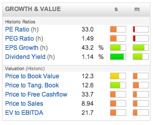
Every company in the market has a different reporting date for their year end. Unfortunately this means that Price / Earnings Ratios based on historical or forecast data can be wildly inconsistent from company to company. One company reporting earnings next week could be on the same forecast PE Ratio as a company reporting earnings in 11 months time. Clearly it would be better to compare them on a like to like basis. What we have done is create a rolling 1 year forecast earnings number which weights this year and next year's earnings forecasts depending on how far a company is through in its fiscal year. This puts every single company in the market on a comparable footing, allowing a like for like comparison across forecast valuation, growth and dividend variables.
The 1 year rolling growth outlook contains several ratios all based on this 1 year rolling forecast dividend and eps outlook. All the following ratios are accompanies by a pair of 'traffic light' indicators showing in colour how each ratio compares against the company's industry peer group and the market as a whole. Please read the TrafficLights™ section above for more information.
- PE Ratio - Much maligned by many as an incomplete ratio in comparison to EV/EBIT, it nonetheless is the most accepted valuation ratio by many investors. If forecasts are available, we publish a standardised forecast PE Ratio based on the current price divided by the 1 year rolling forecast earnings forecast. If forecasts are unavailable we publish the trailing twelve months PE Ratio. Low PE stocks have been shown to outperform high PE stocks in the long term4, but many investors today are willing to pay a premium for quality, and some strategies that have proven exceptionally profitable such as CANSLIM have no limit on the PE Ratio if accompanies by very strong earnings growth.
- PEG Ratio - This is the current PE ratio divided by the 1 year rolling EPS Growth forecast. The PEG Ratio was popularised by Peter Lynch and Jim Slater and shows how much you must pay for each unit of earnings growth. It is generally accepted that a PEG ratio of under 1 signifies growth at a reasonable price (e.g. PE ratio 20 for EPS growth of 20%). Some investors such as Jim Slater prefer looking for PEGs of less than 0.75 - i.e. paying less.
- EPS Growth - This shows the 1 year rolling forecast growth rate. One of the key contributing factors to stock price appreciation is the forecast rate of earnings growth. Accelerating earnings growth and broker forecast upgrades have also been cited by many investment experts such as Bill O'Neil as critical factors in their investment models. This figure should be viewed in tandem with historic EPS Growth in the financial summary section and the trend in forecast data in the broker section.
- Dividend Yield - This shows the expected dividend yield in 12 months time if the broker's consensus is correct. It is important when buying a stock for income that the financial health and dividend history is considered. A high yield can sometimes be an indicator that a company is in financial trouble. The dividend history, dividend cover, financial health and bankruptcy risk indicators should all be considered when buying for income.
Value Ratios
>While growth investors like to look to the future, value investors like to look to the past. Using the rear-view mirror of last year's earnings, we publish four key ratios for value investors.
- Price to Book Value. The book value of a company is its net worth or common equity. It is what is left over when everything that is owed to creditors and lenders is paid off. Low Price to Book Value (PBV) companies have been shown to outperform the market in aggregate by 36bps per month.5 Companies can have a large amount of intangible assets on the balance sheet which are occasionally written off (e.g. due to overpaying for acquisitions etc), as a result we also show the Price to Tangible Book (i.e. subtracting intangibles to provide a more conservative view of value).
- Price to Sales. Kenneth Fisher popularised the Price to Sales ratio in the 1980s in the book Super Stocks6 and it was called the 'King of the Value Ratios' by Jim O'Shaugnessy. While it was misused during the Tech bubble, Fisher used it to show how to buy stocks that temporarily had no earnings which would be missed by traditional PE Ratio searches. Low Price to Sales Ratio stocks, especially compared against their sector, can often be stocks that bounce back very quickly as they return to profitability.
- Price to Free Cashflow. The price-to-free cash flow ratio (P/FCF) compares a company's current share price to its per-share free cash flow. Free Cash Flow is calculated from the Statement of Cash Flows as Cash From Operations minus Capital Expenditures and is the amount left over which a company can use to pay down debt, distribute as dividends, or reinvest to grow the business.
- EV/EBITDA. A ratio much favoured by City analysts and private equity predators. It compares the Enterprise Value (i.e. the market value of shares plus the net debt of the company) to the cashflow figure proxy of EBITDA (earnings adding back interest, tax and non cash expenses like depreciation and amortisation). However, some sceptics might say that a company that has to resort to quoting EBITDA numbers in its financial results may not be making any money at all.
Quality Ratios
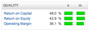
Warren Buffett has been quoted as saying that every time a great manager takes on the challenge of a company with a reputation of bad economics, it is the reputation of the company that will remain intact. A great company with an 'economic moat' will generate high internal profitability. We use the return on equity, return on capital employed and operating margins to analyse this. A good rule of thumb is to look for companies with internal returns (ROE/ROCE) of over 15%. Margins differ in each sector, but great companies have the best margins in their sector.
Its very important to look at the consistency of ROCE and ROE by referring to the financial summary section. Does the company have a chequered history, or is it a cash machine with year after year of strong returns? The operating margins are included to show how well each company can turn a consistent profit on their operations. Companies with a strong moat can maintain pricing power versus their competitors and show consistently high profit margins versus their peer group.
Qualifying Strategies
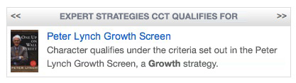
One of the key ways in which Stockopedia cuts your research time is by doing it in the background for you! We have researched and compiled model stock screens from the classics of investment literature, just some of which include: i) bargain investing strategies suggested by the likes of Benjamin Graham and David Dreman, ii) quality and value strategies from Warren Buffett and Joel Greenblatt, and iii) growth and momentum strategies from Jim Slater, Bill O'Neill and Peter Lynch. All of these stock screens are available from the top down screening panel but also from the bottom up on stock pages. Instantly you can see whether a stock in question may qualify for the kinds of strategies that professional investors target.
Margin of Safety
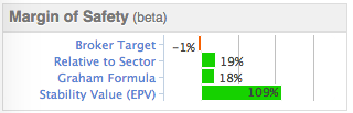
It was Benjamin Graham, the father of Value Investing and tutor of Warren Buffett, who first coined the term "margin of safety". He believed that if you could buy a company at a significant discount to its 'intrinsic value' then the 'margin of safety' would protect the investor from errors of judgement, market volatility and other unknowns. But of course the true value of a stock can be very hard to work out and different methods can give very different answers. We provide a chart on the Stock Report which aims to provide an at a glance indication of the discount or premium of the share price to different valuation models.
This is the most subjective piece of analysis on the Stock Report as there are certain assumptions at the heart of each model. The models span growth valuations, peer group comparables and more conservative 'liquidation' valuations. You can click through to edit the assumptions and learn more about the models as you wish.
Financial Summary
The financial summary is the essential part of each Stock Report providing 6 years of historical data and 2 years of forecasts. Many investors as esteemed as Warren Buffett consider a consistent operating history to be a pre-requisite before a purchase. A quick scan of the company's financial history can ensure that you are not gambling on a story stock but investing in one with a real business and sustainable business model.
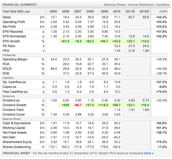
Turnover and Earnings While many companies can grow their topline and bottomline, many can't do it without destroying shareholder value. The important thing for shareholders is to look at sales and earnings growth on a per share basis rather than for the company as a whole. If a company is growing eps every year consistently at a strong and sustainable growth rate then it may be worth closer examination.
Quality The very best companies show consistent ROCE and ROE figures of above 15% every year, strong operating margins likewise help to build a picture of a company that has a durable competitive advantage and economic moat. Investors such as Warren Buffett have indicated that these metrics are critical in finding great stocks.
Cashflow Some companies report high profits, but they can't turn those profits into cash! A company can't survive without cash, and if it can't generate it internally it will have to go to outside investors to support it, resulting in either share dilution or increased borrowing. We show the Operating Cashflow on a per share basis - from that cash a company has to make capital expenditures to maintain its current business (capex) - the Free Cashflow left over a company can use to pay down debt, distribute as dividends, or reinvest to grow the enterprise (hopefully not at a low ROCE!).
Dividend, Growth and Cover - when looking for income stocks, one also has to consider the safety of the dividend. Has the company grown its dividend every year without fail? Have they had to cut a dividend? Does the company have significant cover as headroom each year?
Net Current Assets - also known as the working capital of the company. Some investors such as Benjamin Graham look for companies that trade for less than the value of their net current assets - bargain stocks.
Financial Health
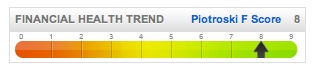
The Financial Health trend meter is based on the Piotroski F-Score, a 9 point scoring system that analyses the trend in a company's accounts across a set of tests that cover profitability, leverage, liquidity, sources of funds and efficiency. Piotroski showed that stocks scoring 8 or 9 significantly outperformed stocks scoring 1 or 2. It is a good shorthand for deeper financial analysis and the popover on click gives a breakdown of how the score is compiled, quickly highlighting red flag areas. More recent studies have shown that focusing on high F-Score stocks can reduce the volatility of returns in a value portfolio.
- Popup Checklist - click the link to generate a checklist for the 9 points that Piotroski covers. Quickly assess the weaknesses in a company's accounts.
Bankruptcy Risk
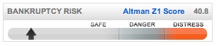
In the 1970s Professor Altman created a statistical measure called the Z-Score which he showed predicted to a 75% accuracy the probability that a company would experience significant financial distress within 2 years of the score flashing 'in the distress zone'. Our visual interpretation of the Z Score gives a quick indication of the company's general financial risk.
- Popup Breakdown - click the link to generate a breakdown of the Altman calculation. Strictly for the Finance Geeks out there!
Earnings Manipulation Risk
Professor Beneish created the M-Score to highlight companies that may be massaging their earnings figures for reporting purposes. Many companies can increase their reported earnings by booking sales early, delaying expense recognition, capitalising expenses and other tricks of the trade. Most of these tricks aren't illegal, but regular practice can signify a company that may be getting into bad habits. The M Score predicted such high profile failures as Enron and has even been shown to be useful as a short selling technique.
Magic Formula Ranking
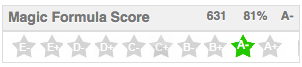
Joel Greenblatt's Little Book that Beat the Market became a financial publishing phenomenon. In a simple writing style, the successful hedge fund investor showed how picking 'good' stocks at 'cheap' prices was enormously profitable. By adding the ranks of Return on Capital (good) and Earnings Yield (cheap) across the market we have compiled our own Magic Formula rank which we believe is the best version in the UK market. Greenblatt suggests sticking to A+ stocks (in the top 10%) for the best chance of outperformance and ideally to a basket of the top 50 ranked stocks in the market. 7
Brokers Forecasts
Behavioural scientists have shown repeatedly that experts in every field are poor forecasters, being inaccurate, over confident and slow to change their opinion. Research analysts are no exception, and studies by GMO has shown that their forecasts tend to lag reality. Analysts tend to raise forecasts too slowly in good markets, and reduce them too slowly in bad markets.
This section of the Stock report shows detailed earnings forecast data and whether analysts have been increasing or reducing their forecasts on a 1 month and 3 month basis. The numbers are colour coded for quick review. Due to price anchoring, it tends to be a positive signal if forecasts have been repeatedly upgraded, and clearly a negative one in the opposite scenario.
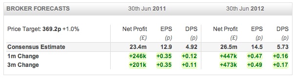
- Price Target - This shows the consensus price target given by covering brokers. The numbers are at the discretion of each broker and tend to be on a 1 year timeframe. They should be used with caution.
Broker's Consensus
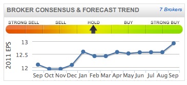
- Brokers Consensus - These recommendation and targets should be taken with a pinch of salt. Due to the fact that many broking firms also provide corporate finance services to their clients, it has been shown that brokers are reluctant to put out 'sell' recommendations. The majority of stocks analysed in the city are 'buys' or 'outperforms', and much research has indicated that stocks with a 'sell' rating actually outperform stocks with a 'buy' rating. This indicator is provided for reference only, but can sometimes be used as a useful contrarian signal.
- Forecast Trend - The trend in forecasts is charted below the broker consensus. This shows how the current year forecast has changed over the last 18 months. Most investors soon learn that companies with a habit of beating forecasts tend to outperform the market. The reason is that due to a behavioural quirk called price anchoring, analysts tend to raise their forecasts too conservatively. This can lead to sequences of earnings upgrades and surprises which investors can take advantage of.
Graphical History
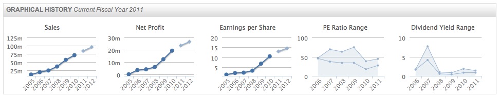
Simple charts are provided on each stock report showing historical and forecast trends of EPS, DPS and Turnover. Strong consistent growth is generally regarded as a positive signal for stock price appreciation and stability. The PE Ratio and Dividend Yield Range charts are useful tools to put the current valuation into a historical perspective. Many value investors will only consider a stock purchase at the lower end of the historical range.
Profile Information
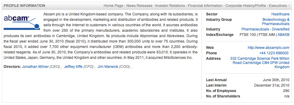
The Profile section provides an "at a glance" summary of the company's business model and its key executives, with links for further reading about the Management Team.
Detailed Quote
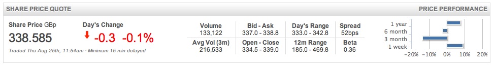
We also provide a detailed 15 minute stock quote, providing volume, liquidity and price performance data at a glance.
Help us improve this page...
We are constantly developing and looking for ways to improve the tools we create for investors. If you or anyone you know has ideas that can make the Stock Reports better, more complete and more informative please do get in touch. As mentioned previously, we really do want to focus on factors that have been proven to have a quantitative impact on stock returns - please do bear that in mind and help us make Stockopedia the best place for stock pickers on the web today.
Thanks for listening,
The Stockopedia Team
References
-
Jegadeesh & Titman, "Returns to Buying Winners and Selling Losers, Journal of Finance 1993 ↩
-
George & Hwang The 52 Week High and Momentum Investing, Journal of Finance 2004 ↩
-
Curtis Faith The Way of the Turtle, McGraw-Hill 2007 ↩
-
Dreman Overreaction, Underreaction, and the Low-P/E Effect, Financial Analysts Journal 2005 ↩
-
Fama & French The Cross Section of Expected Stock Returns, Journal of Finance 1992. ↩
-
Kenneth Fisher, Super Stocks, McGraw Hill. ↩
-
Joel Greenblatt The Little Book that Beats the Market, Wiley. ↩
 Let’s get you setup so you get the most out of our service
Brilliant - You've created a folio! Now let's add some stocks to it.
Let’s get you setup so you get the most out of our service
Brilliant - You've created a folio! Now let's add some stocks to it.