These markets are suffering badly from a global liquidity squeeze as central banks remove QE and hike rates. The media is enjoying pinning the blame on Truss and Kwasi Kwarteng but the real issues run a lot deeper. I'm not going to go into global macro mode, but it's pretty clear that we're now paying for all the Ponzinomics that have gone on for the best part of 20 years. Whether central banks can reintroduce the punch bowl remains to be seen - but I've no doubt that at some point these stock markets will turn around.
Given the above, and given we're all hurting in our equity portfolios, I thought I'd take a look at the FTSE AIM All Share history. I always think think that the AIM market is the best barometer of private investor sentiment in the UK - when its rising animal spirits rejoice, when it's falling those spirits retreat to their cave. Right now we're all in our caves.
In doing an analysis like this, one has to be very careful. You can't apply the lessons from the past unless they apply to the future. There is a real risk that there's a "regime change" going on. If we are shifting from a perpetually low interest world, to a perpetually high interest world, then this analysis may be redundant. Nonetheless, it's instructive so let's proceed.
Drawdown Charts
Below is a chart of the FTSE AIM All Share in blue. I have history for this index back to 1996, but I've decided to exclude the dotcom drawdown period (2000-2003) as that was such an unusual period, and the AIM index was full of nonsense companies. I remember it well - there was one conference I went to where someone stood up to talk about their just floated IPO (which seemed to have 1 employee - him - and a slide deck and no business) - and it went from a £5m cap to £50m overnight. Might have been £100m. Can't remember the name.
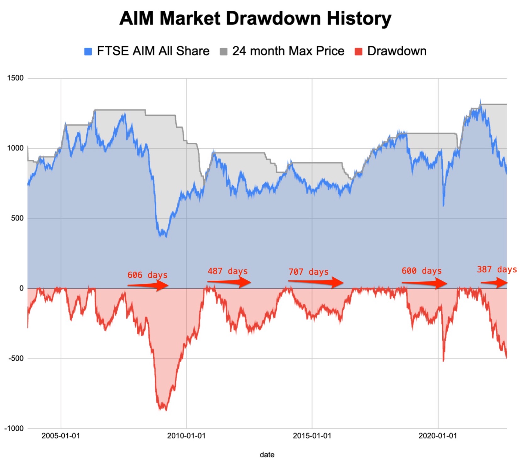
In **grey** is the maximum price over the trailing 24 months. The difference between grey "max" price and the blue "index" price is the current **drawdown** - which is published in red underneath the chart. Please note that this is not a % drawdown chart - it's a nominal chart - so you can't really compare each…