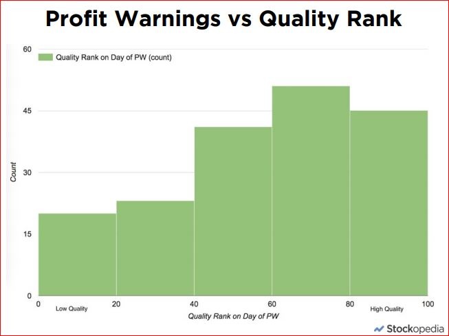
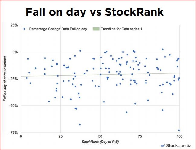
Stockopedia subscribers will be aware that last week we published a study of 245 profit warnings as "The Profit Warning Survival Guide" ... you can catch up on all the content in our quick read eBook, 30 minute Webinar and accompanying set of slides. In the next few weeks we'll be serialising some of the content as blogs on the site. For a background to the study please do read Ben's introduction here. This article summarises one of the key findings... the average price performance of a stock during a profit warning. The results are quite eye opening.
By combining the price histories before, during and after each profit warning in our study we built a model of the average price performance of a profit warning stock. Initially we looked at the week before a profit warning up to three months after, but the analysis was so startling that we had to push our timeframes out on both sides. It was only then that we could understand the full, complete picture.
While the majority of the drama happens on the day of the profit warning itself, the true story unfolds over a two year period. It starts 120 trading days (almost 6 months) before the event and continues to unfold over the next 360 trading days (almost 18 months) after the event. This creates a stunning visual picture we're calling The Anatomy of a Profit Warning.
Price Performance around a Profit Warning
Here’s a chart of the average profit warning decline in all its glory. If there’s one thing to remember from our entire research study, this may be it. We recommend burning this image into memory.
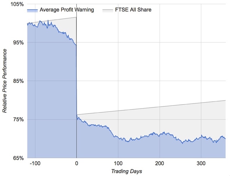
- The horizontal axis shows the number of trading days before and after the date of the profit warning (day 0).
- The vertical axis shows the price performance as a percentage of the starting value at a date 120 days before the profit warning.
- The blue line and area signifies the price performance of the average profit warning.
- The grey line denotes the return of the market average (FTSE All Share) over this timeframe expressed as a straight line. The grey area signifies the opportunity lost by holding onto a profit warning stock.
- NB - we used the first 135 profit warnings in our database in this chart study…