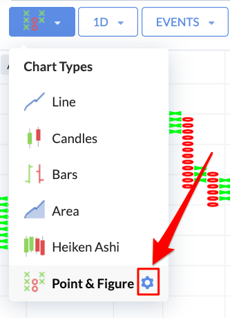
Changing the chart type
By default, the Stockopedia charts are presented as standard Line charts, which plot the closing price of each day and join these points into a single line. This is the basic tool for analysing price trends and momentum. You can change the type of the chart by using the first menu next to the search box.
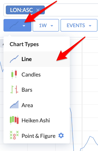
We provide an array of chart types including:
- Line Charts
- Candlestick Charts
- Bar Charts
- Area Charts
- Heikin Ashi Charts
- Point & Figure Charts
Some of these will be familiar to many investors, while others may be less so.
Chart Type Basics
It’s important to understand the components of a price chart. Most charts are composed of a time series of price ‘bars’. Each bar, or unit, of pricing information will have 6 components which include the date, price and volume that define the period…
- the date (or time) of the trading period
- the opening or first price of the period (O)
- the highest price reached during the period (H)
- the lowest price reached during the period (L)
- the closing (or last price) of the period (C)
- the volume of shares traded during the period (V)
These components are used differently by different chart types, but are the common underlying unit. Price Bars such as this are often summarised as OHLCV data.
Understanding this, here follows a quick description of each main Chart Type:
Line Charts
Line charts are the default on Stockopedia. They join up each day’s closing price into a continuous line - closing prices being the most important price of each day. They are the simplest chart type and often popular with investors due to their simplicity.
Candlestick Charts
Candlestick charts - use the full OHLC data. Candlesticks are an old Japanese invention that help investors more clearly visualise a day’s trading.
There are two parts to a Candle.
- The first part is a thin vertical line (often called the wick or shadow) which shows the range through which a stock’s price has travelled on a trading day. The upper end of the wick shows the high price, while the lower end shows the low price.
- The second part is a filled rectangular body which is green if the stock price closed higher than the open price, or red if it closed lower than the open price.
The colour coding makes it easier to spot price trends, while the length of the candle can be an indicator of volatility.
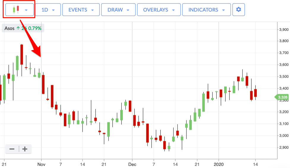
Some notes:
- Days where the close price is higher than the open price are marked as a coloured green rectangular body.
- Days where the close price is lower than the open price are marked as a coloured red rectangular body.
- The upper line extends vertically from the body when the high price is higher than the highest of the open or close price. This is known as the upper shadow.
- The lower line extends vertically down from the body when the low price is lower than the lowest of the open or close. This is known as the lower shadow.
There are entire books written on Candlestick charting with the most famous being Japanese Candlestick Charts by Steve Nison.
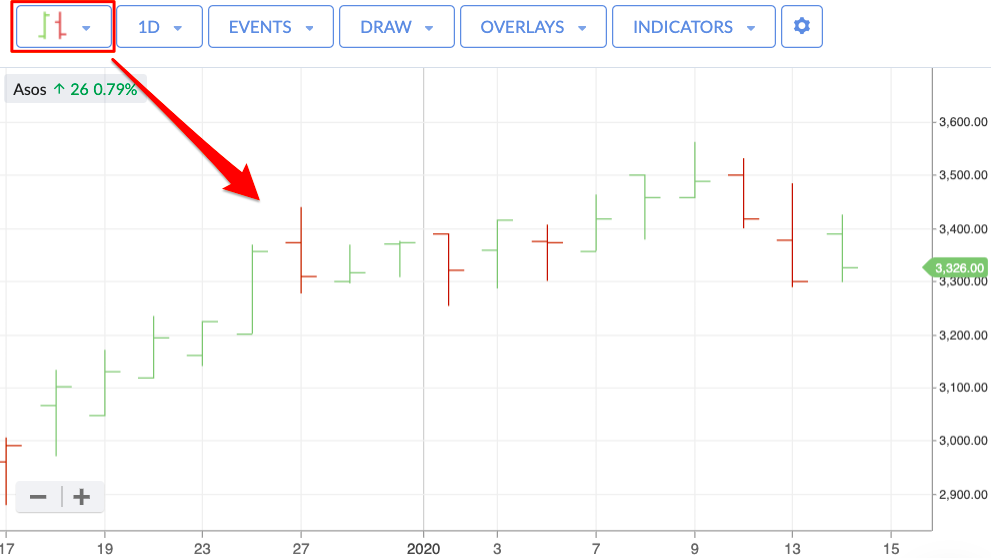
Bars
Often known as ‘OHLC’ charts, these are a simpler representation of the same data in Candlestick charts. Bars work very much like Candles in that they're designed to show the daily open and close price - shown in the left and right horizontal bars - as well as the price range of a stock on a given day - shown in the vertical bar.
Like Candles, the bars are green if the stock price closed higher than the previous day, or red if it closed lower than the previous day. This makes it easy to see the range of price movement in a stock on a daily basis over any given period of time.
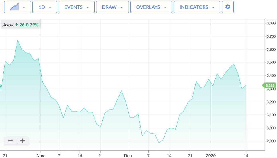
Area
Often called “Mountain” charts, Area charts are a more simplified interpretation of standard Line charts. They plot closing prices over a given period, and the area beneath the line is shaded.
Heikin Ashi
Heikin Ashi charts are a variation on conventional Candlestick charts. In both cases, the daily 'sticks' are calculated using OHLC price data. But with Heikin Ashi, the formula is a bit more complicated. It's designed to be an improvement over normal Candlesticks by filtering out more 'noise', and they are popular as a result. The Heikin Ashi candlesticks are useful when trying to identify trends. Green candles indicate an uptrend, and green candles with no lower shadow indicate a strong uptrend. Conversely, red candles point towards a downtrend and red candles with no upper shadow even more so. A candlestick with a small body and long upper and lower shadows is reflective of indecision and might represent a trend change.
Point & Figure
Point & Figure charts are different to conventional charts that track prices over time. The approach is all about looking for trends in prices. For that reason, the only axis that counts on a Point & Figure chart is the price axis.
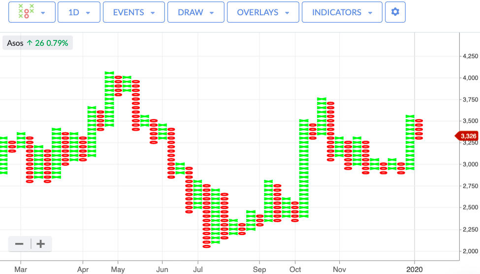
The columns are built using Xs and Os. An X column (green) denotes a rising trend over a period, and an O column (red) denotes a declining trend.
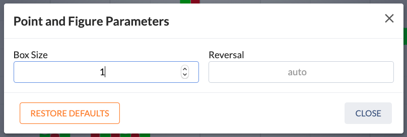
There are two settings that are used in the construction of a P&F chart: the ‘box size’ and the ‘reversal amount’.
The ‘box size’ represents the the unit of movement a stock price must rise or fall before a new X or O is drawn on the chart.
The reversal amount comes into play when there is a reversal in the price trend. It represents the number of units a price must move before a new column is started on the chart.
When using P&F charts, you must input values for both the ‘box size’ and ‘reversal amount’ using the P&F settings. To do that, click the ‘cog’ icon next to Point & Figure in the Charts menu.
As a guide, one of the most popular settings used in Point & Figure charting is to set the ‘box size’ at 1, and the ‘reversal amount’ at 3. Whatever settings you choose to use, the ‘box size’ must have a higher value than the ‘reversal amount’.
The whole idea with Point & Figure charts is to cut out as much noise as possible (such as small price movements) to see how a price is trending. It's then possible to make trading decisions based on a multitude of strategies that use Point & Figure charts as an indicator of how prices are moving.

