Moving Averages
Moving Averages can reduce the noise of short-term price volatility to give traders a more insightful view of how the price of an asset is behaving over time. This makes them a great tool - if you know how to use them effectively.
Basics
-
What are Moving Averages?
A stock indicator commonly used in technical analysis. The preferred choice among traders is the Simple Moving Average (SMA), which takes the arithmetic mean of a given set of prices over a specific number of days in the past. By contrast, the Exponential Moving Average (EMA) is a weighted average which gives more importance to stock prices on recent days, these are often used over short time scales. -
What are Moving Averages used for?
The Moving Average line is popular among traders because it can smooth out the ‘noise’ of short term price volatility. This gives a more insightful view about how a price is trending over time. -
How to calculate a Moving Average?
To calculate the Simple Moving Average, add together the closing prices of a security over a set period of days and then divide by the number of days in the series. -
What is the standard Moving Average length?
The 50-day Moving Average is the standard swing-trading Moving Average, and is mostly used by traders to ride trends since it is an ideal compromise between a short and long term line. The 200-day Moving Average is more relevant for traders who are looking to trade with the trend and stay in trades on an intermediate to long-term time frame and can be a major signal that price is being accepted over the long-term downturn trend.
How to use Moving Averages
Moving Averages can be used to help you find trades, ride trends and exit trades in a systematic way. Here are some strategies that you might consider using.
Moving Average direction
The single simplest way to incorporate Moving Averages into your investment approach is to note the recent direction of the indicator and where the price is in relationship to it. The principle that some traders adhere to is that once a price starts trending, there is a chance that the trend will continue.
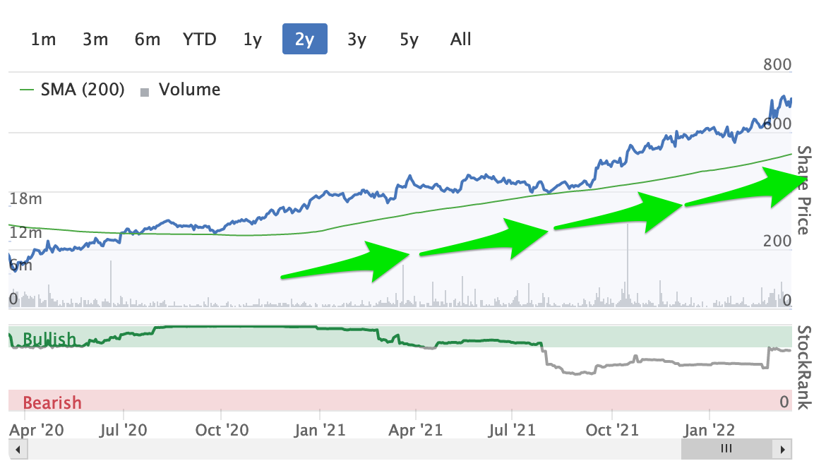
A chart may be considered bullish when a Moving Average is trending upwards and the current price is above the Moving Average, and bearish when the Moving Average is trending downwards and price is below the Moving Average.
A bullish MA uptrend signal
- The Moving Average should be rising and pointing upwards
- If price is above the Moving Average, some traders will interpret this as a buy signal
A bearish MA downtrend signal
- The Moving Average should be pointing downwards
- If price is below the Moving Average, some traders will interpret this as a sell signal
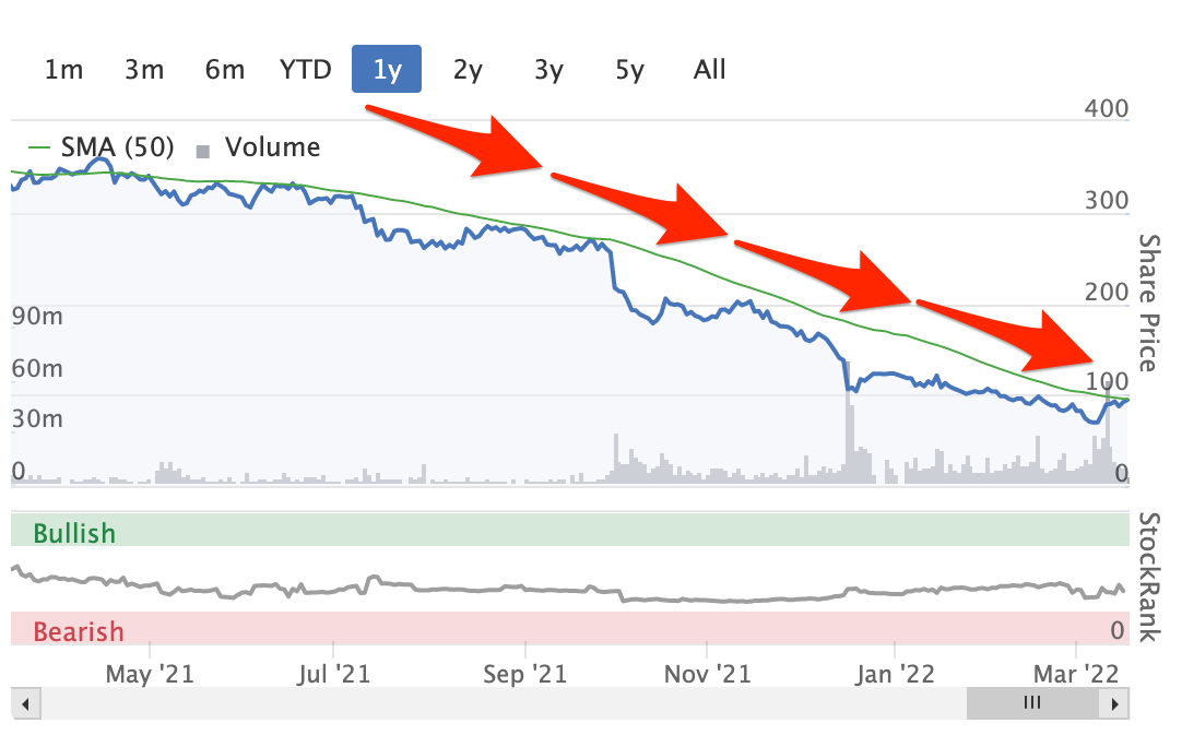
Based on this, it’s also interesting to note how steep the Moving Average line is, because it can be a guide to the strength of the trend. On this basis, a flatter Moving Average line would indicate a weaker trend. Most trend-following traders look for obvious trend lines heading in a clear direction, either up or down, to gauge their opportunities and position risk.
A technique for identifying opportunities by using multiple time frame analyses
There are several ways that traders endeavour to get an edge on the market, one of them being to implement multi-timeframe analysis, which helps identify the right time to enter and exit trades by comparing the chart over different periods of time.
The aim is to filter out charts with a low probability of succeeding, and focus instead on charts that are trending. This then makes it possible to drill down to a smaller time frame chart to fine-tune position entry or exit. Furthermore, it can more clearly display price support and resistance levels more accurately, which allows traders to identify entry and exit points faster.
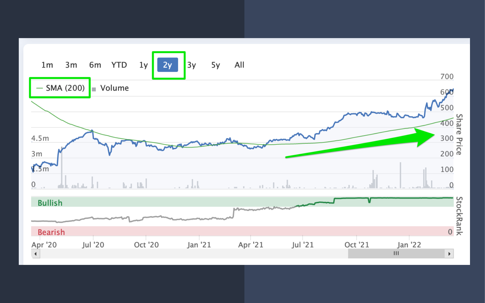
The good news the smart default lines on Stockopedia’s Mini Charts smartly adapt to this technique. A simple way to get started is by looking for longer term charts on the 2 year selection to see where the 200d Moving Average is trending upwards.
Next, by switching the view to 1 year, it’s possible to consider how the price has changed over the last 150 days as well as how this change interacts with the 50d Moving Average line.
A positive sign might be for the price to be greatly above the Moving Average for the first 100 days (marked as 1 in the example), and more tightly in line for the next 50 days (marked as 2 in the example).
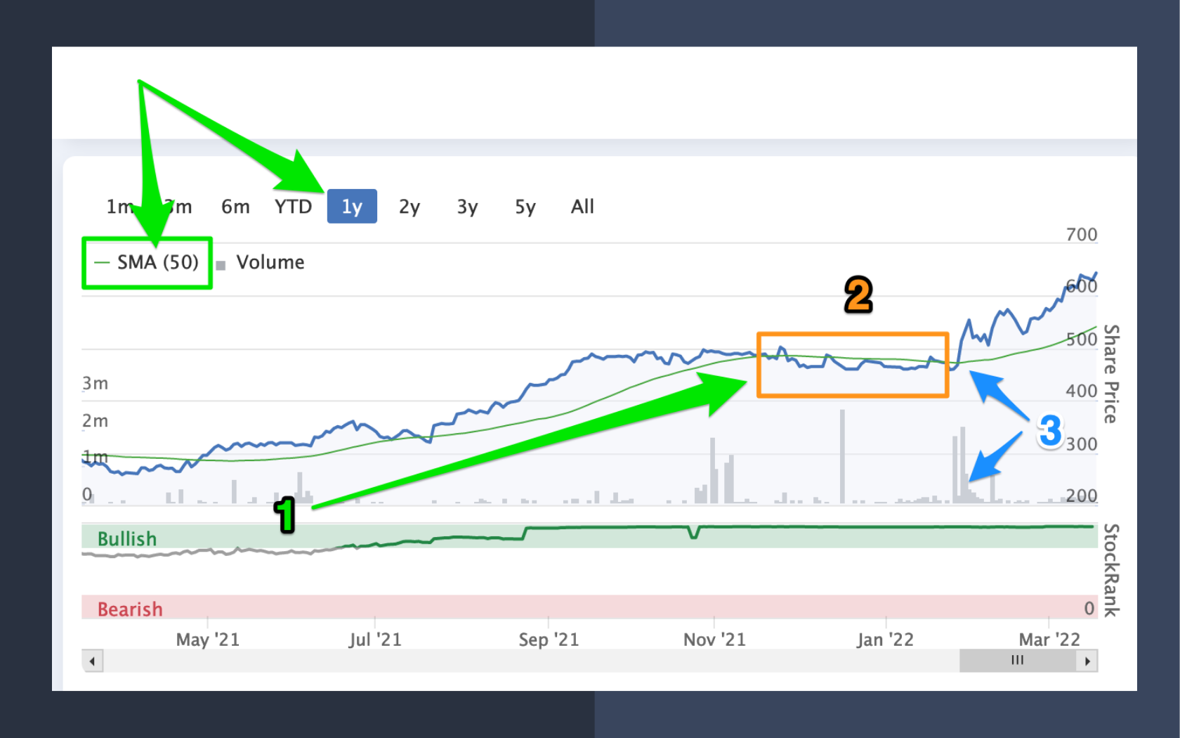
If the price then rises above the Moving Average (marked as 3 in the example), the chart could be described as having a longer-term trending price, with recent tight price acceptance - and the latest higher price could be the start of the next leg up in price. In combination with a high volume traded, it could be a buy signal for some traders.
One of the easiest ways to gather charts that may be displaying this type of trend is to use the Screener. This article details strategic information regarding golden crosses and the death cross for consideration: https://www.stockopedia.com/learn/charts-&-technical-analysis/how-can-i-find-golden-crosses-640818
Full screen charts
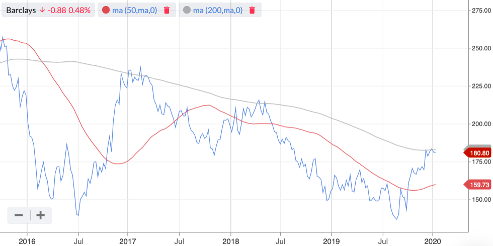
To add Moving Average overlays: Click the Moving Average option in the menu. By default this will add the 50 Day Moving Average. In the drop-down you’ll see that you have added the MA line to your chart.
You can repeat the process, and add click Moving Average again, to add a 200 Day Moving Average. Importantly, you can add multiple MA lines - and all of them can be customised.
To customise a Moving Average line: Click the Moving Average link at the top right-hand side of the chart (see image above). This will open a modal window where you can adjust the timeframe and toggle between a Simple Moving Average and an Exponential Moving Average. In addition, you can also change the colours of your Moving average lines, by clicking the colour circle in the settings modal.

