Changing between tables, charts & bubble views
Whenever you are looking at a list of stocks in Stockopedia - on a folio, screen, index or sector - at the top of the table you’ll find what we call the View Bar. At the top right of the view bar you’ll see a set of 3 clickable buttons:
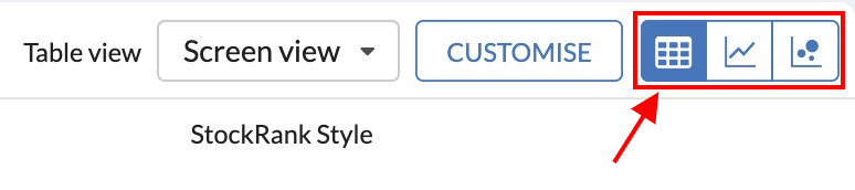
These buttons give you different ways to visualise the stocks in the list. From left to right the buttons allow you to view your stocks:
- As a list in a table, and
- As a set of charts across different timeframes
- As points on a bubble chart with various factors as axes
Let’s go into each in a little more detail:
1. Table View
In general, tables are the default way you view stocks on any page on the site. This set of tables is ‘yours’ wherever you go and with just a few clicks you can customise them to show the information that you want. You can find out how to do that in Customising Tables.
To make things simple we’ve preset eight Filter Views with the information that we think is most useful. You can click the tabs in the view bar to access any of these tables and access a wealth of information. The data in each table is summarised as follows:
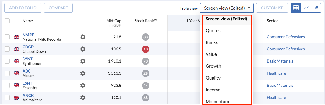
- Quotes - This gives you the intraday price, price changes and trading volume information of the stocks on the list.
- Ranks - This view shows how investments are rated according to Stockopedia's StockRanks including Quality, Value, Momentum and Growth Ranks. Also shown are the companies' Risk Ratings and StockRank Styles.
- Value - Here you can find the most common relative valuation metrics like the P/E ratio, P/B ratio, P/S ratio and more advanced Enterprise Value measures.
- Growth - A filter view providing at-a-glance information on popular historic and forecast growth measures for every stock in the list as well as some compounded multi-year measures.
- Quality - Profitability metrics like the return on capital, return on equity and margins can be viewed here, alongside "The Professors" (Piotroski F-Score, Altman Z-Score and the Beneish M-Score).
- Income - This shows stock current, forecast and 5 year average yields, as well as dividend cover and information about the dividend growth persistence in recent years.
- Momentum - This table shows absolute and relative stock performance. Proximity to various moving averages and 52-week high prices are also given.
- Holdings - When viewing a list of stocks in a Folio, the Holdings tab is the default view. It allows you to quickly see the position valuation, gain and movements at any time. This view is meaningless in other contexts.
Of course, you might have your own combinations of data you would like to look at - so go ahead and set up your own customised views with our Table Editor. You can explore further in Customising Tables.
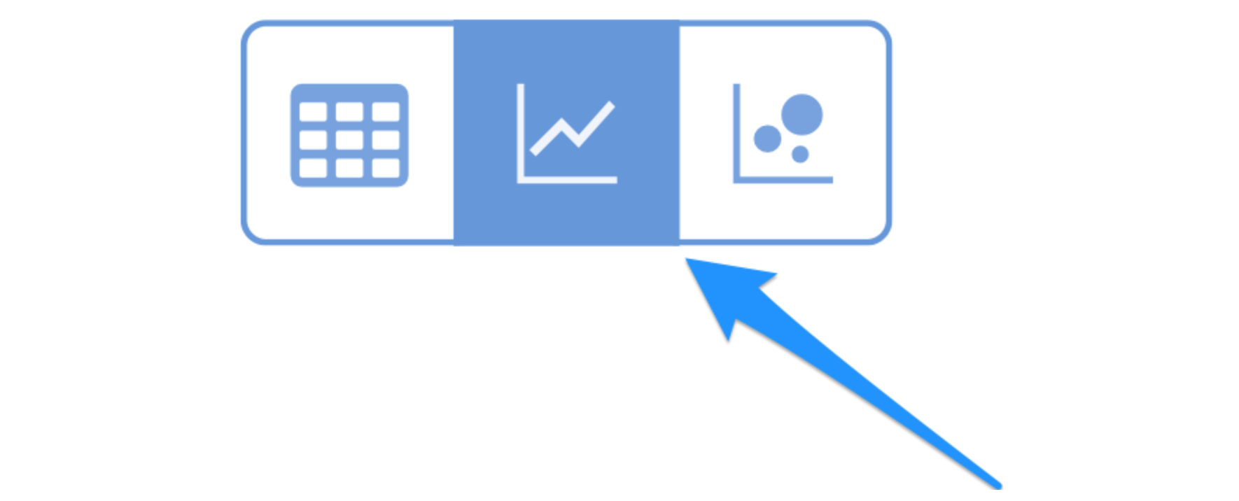
2. Chart View
Clicking the second button in the view bar activates the Chart View.
This illustrates every security in the list as a series of share price charts in a grid on the web page - allowing a super fast way to quickly assess which shares are trending upwards or consolidating in a price range.
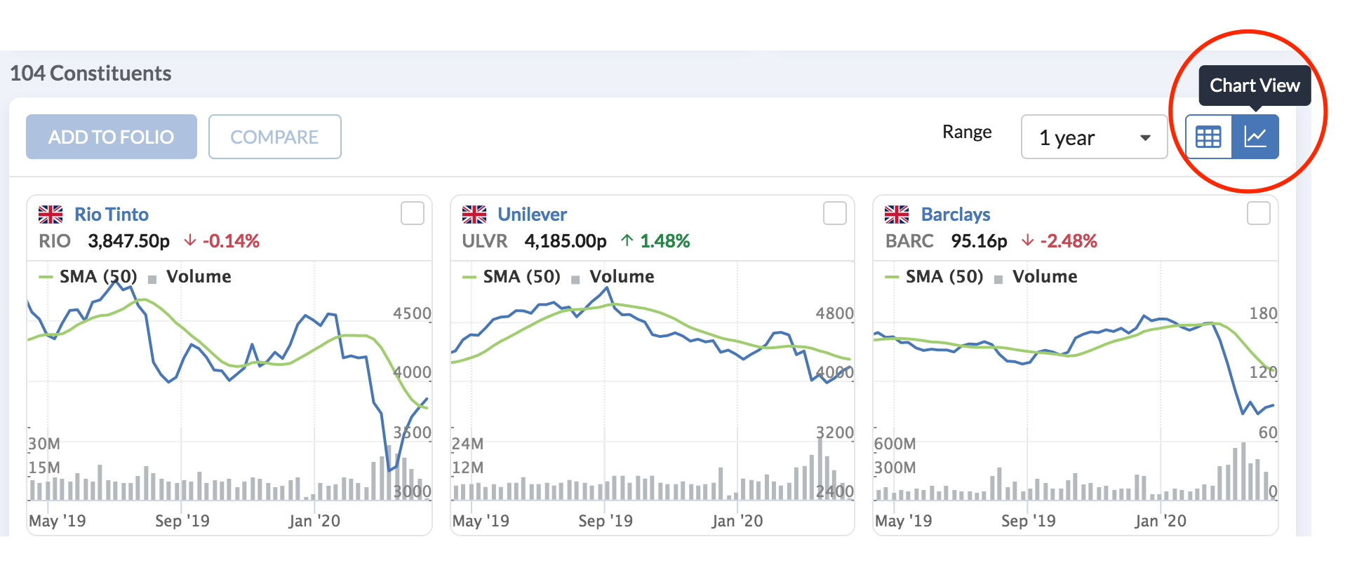
In the Chart View you’ll see some options to switch the time view of the charts between 1 week, 1 and 6 months and 1, 3 and 6 years.
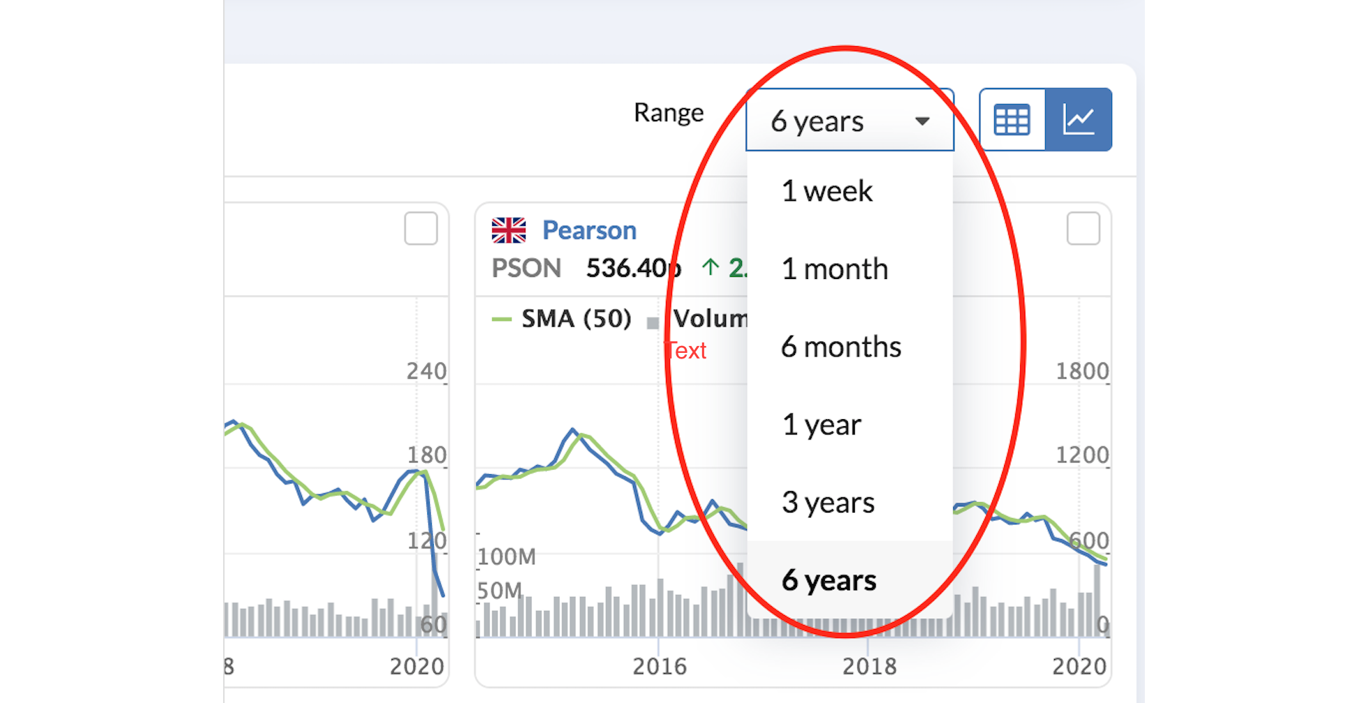
In addition, each Mini Chart includes:
- The current share price and percentage price change on the previous day's close (up to 15 minutes delayed)
- A 50-Day Simple Moving Average will be displayed when the chosen periodicity is 1 year or under, and a 200-Day Simple Moving Average will display when the chosen periodicity is over 1 year.
- A Volume chart showing share trading volumes over the time range you have selected
- A country flag indicating where the stock is quoted
By clicking a Mini Chart you'll be taken to the stock's main price chart in the Stockopedia's Charts area.
3. Bubble View
Clicking the final button in the view bar activates the Bubble View.

Bubble Charts provide a great visualisation of the types of shares in a Stock Screen or Folio. At a glance these charts show the trends and patterns in a group of stocks and can help identify areas of concern.

You can find a detailed explanation of Bubble Charts here.

