Stockopedia helps you navigate vast amounts of data, but when it comes to daily routines, or even just moving between pages, there was scope to make it a much faster and enjoyable experience.
In our latest updates, we've launched space-saving menus that make it quicker and easier to get to where you want to go. We've also introduced a much-requested new pager that slashes research time by letting you quickly flick through StockReports and Charts at the click of a button.
Hover menus - navigate faster with fewer clicks
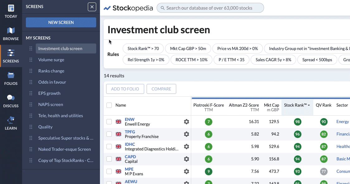
On the main navigation menu, areas such as Browse, Screens, Folios and Discuss all have their own sub-menus to help you find what you are looking for. But until now, moving between different areas of the site took multiple clicks, which was disruptive and slow.
To solve this, we have introduced hover navigation. When you activate this new option, whatever page you are on, you can now hover over the main menu and instantly see any of the sub-menus. That makes it easier to choose where you want to go and means you can get there with just one click. It gives you fewer distractions and a faster, more enjoyable experience.
To get started with hover navigation, just click the X at the top of any sub-menu to 'Unpin' it - as explained in this video:
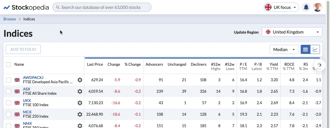
More horizontal space for table displays
It isn't just journey times around the site that have been upgraded with the new hover navigation. Until now, sub-menus always stayed open on the page until you clicked to close them. This is still the default setting but now, with the hover menu active, menus will tuck themselves away. This change gives you as much horizontal space on the page as possible - which is a huge gain for those that like to have lots of data in tables in front of them.
On those occasions when you do want a sub-menu to stay where it is, all you need to do is click the Pin/Unpin button at the top. That means you always get the most space possible but stay in control of how and when the sub-menus appear.
Page through the stocks & charts in your lists with ease
One of the previous frustrations when analysing ideas on Stockopedia, was that switching back and forth between long lists of stocks and their respective StockReports and Charts was time-consuming.
We've now made these workflows much quicker and easier with a new pager that makes flipping through StockReports and Charts a cinch.
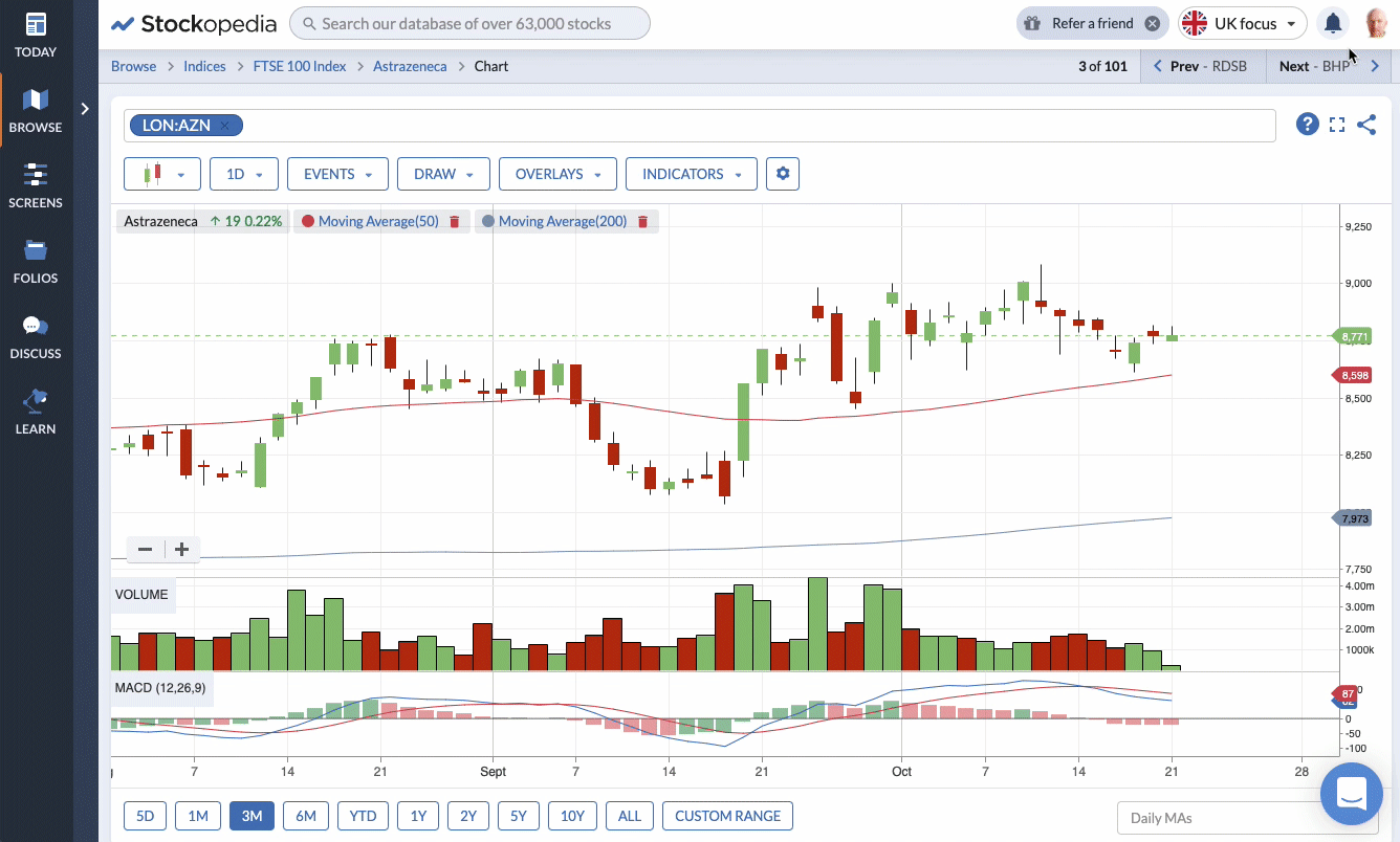
Faced with a long list of stocks, you can now click the first name and then use the pager -using keyboard arrows or clicking on the Previous and Next buttons - to quickly flick through anything from Stock Reports and Accounts to Technical Charts.
This will make a huge difference to the time spent finding ideas, especially for those doing deep research on the platform. Chartists in particular, will welcome the ability to scroll through pages of charts in a matter of seconds.
This upgrade has been long-awaited and it helps you focus on what's important: streamlining the process of finding the next opportunity - and dramatically reducing the number of clicks it takes to do it.
Breadcrumbs to show you where you are and where to go next
With the introduction of hover navigation and the new pager, we've also taken the opportunity to improve the navigation 'breadcrumbs' that you see at the top of most pages.
Everybody's workflows and journeys around the site are different. So we've made sure the breadcrumbs now provide a more intuitive guide to where you are on the site and clearly show which list you are paging through.
If you are viewing a stock in the context of a list, such as a Folio, Screen or Index, the breadcrumbs and the pager will reflect this. The pager then allows you to quickly flick through the items in that list, which makes it easier to retrace your steps without having to start over.
If you have reached a page without using the hover navigation, the breadcrumb trail will default to the sector and industry group. This is useful because it provides context and detail about where the page is and where you might choose to go next.
Improved mobile experience - with a new back button
Stockopedia is designed to work on any device, including mobiles and tablets. But until now, one of the gaps in functionality for mobile users was the lack of a back button in the app. While many phones and tablets come with a back button, some (such as Apple iPhones) don't.
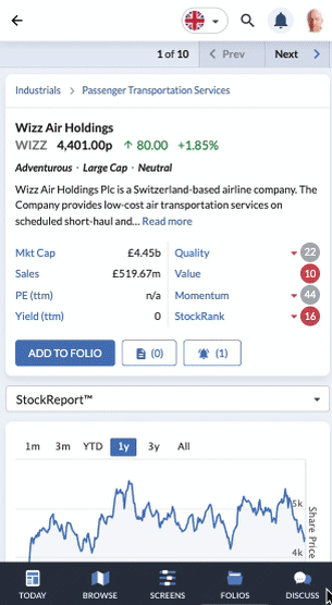
To solve it we've now added one to the mobile 'app' platform. This makes a huge improvement to the mobile experience. It also brings an end to the risk of mobile users experiencing frustrating dead ends from which it was hard to escape without going back to the start.
To receive the optimum experience of the site on a small screen, we highly recommend adding the Stockopedia app to your device's home screen (rather than just using a mobile internet browser). Instructions on how to add Stockopedia to your home screen can be found here.