In recent weeks the Stockopedia team has wrapped up work on some important design and functionality improvements.
You now have much-improved Mini Charts right across the site, delivering more stock-level technical data in an instant. Our design team has also rolled out a host of subtle but essential changes that ensure we're meeting web industry standards on colours and typography - making Stockopedia easier to read and even better to use.
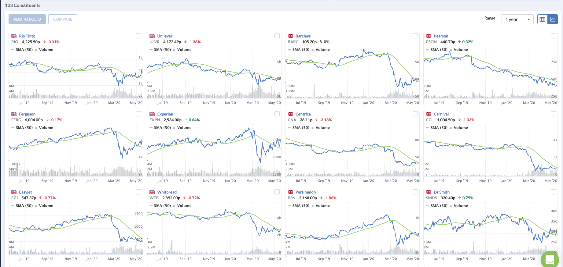
Mini Charts - more data on more stocks in one view
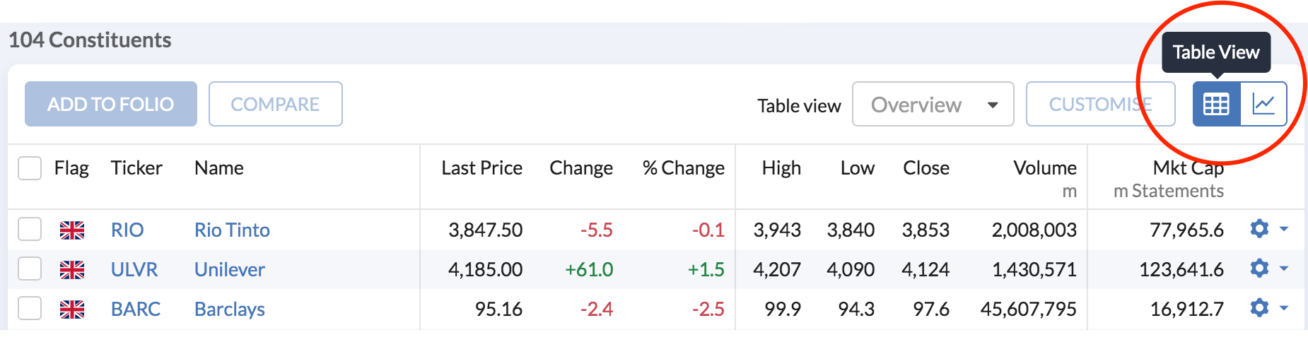
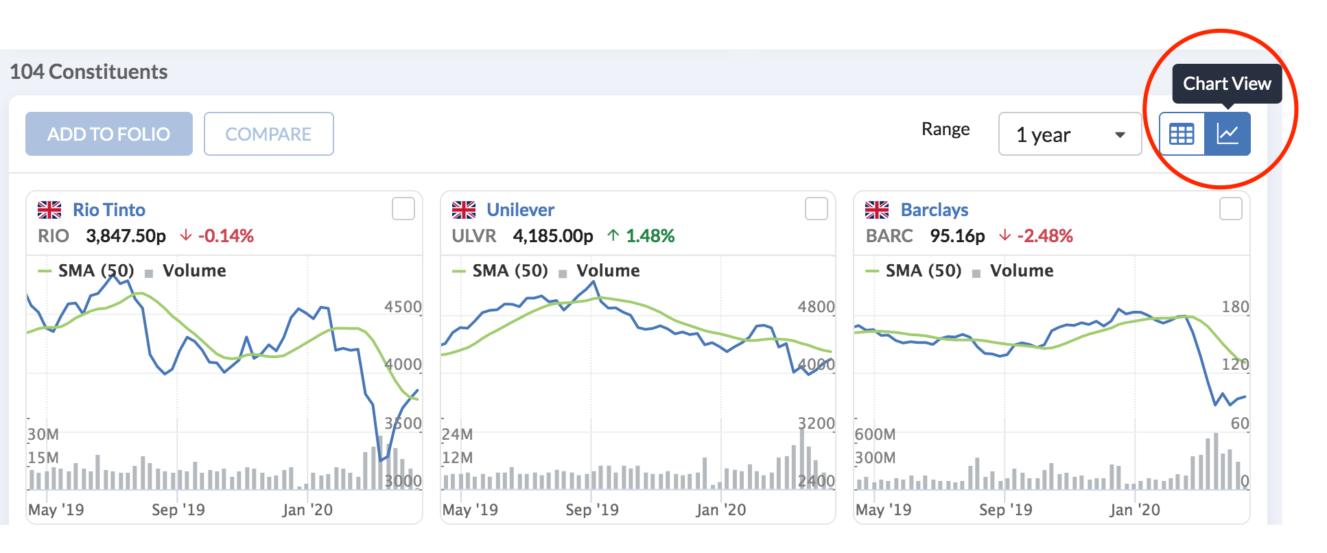
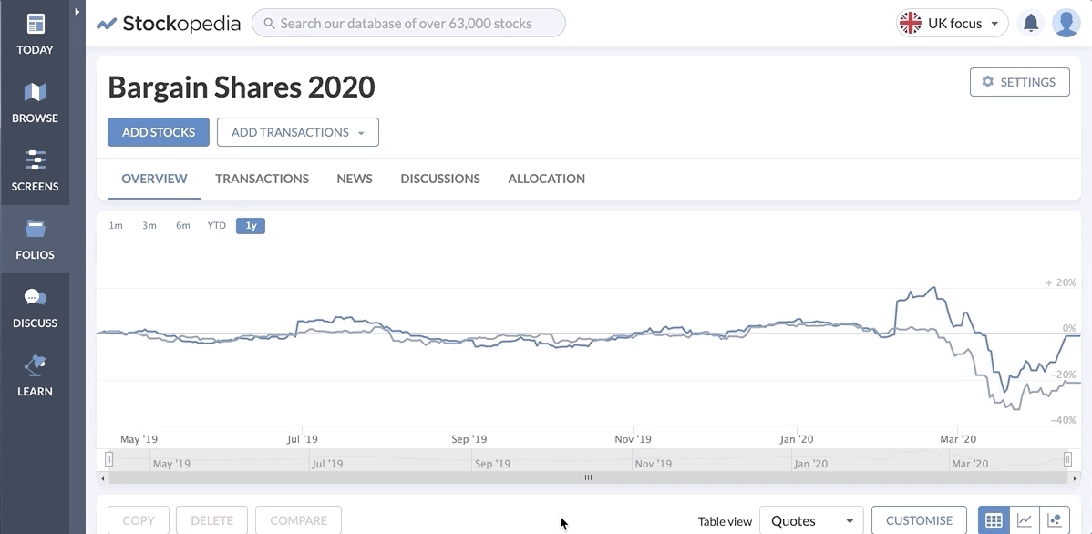
Mini Charts are a familiar feature right across Stockopedia. Whether you're reviewing lists of stocks in indices, sectors, screens or portfolios, our Tables always give you the option to switch between the standard Table View and Chart View:
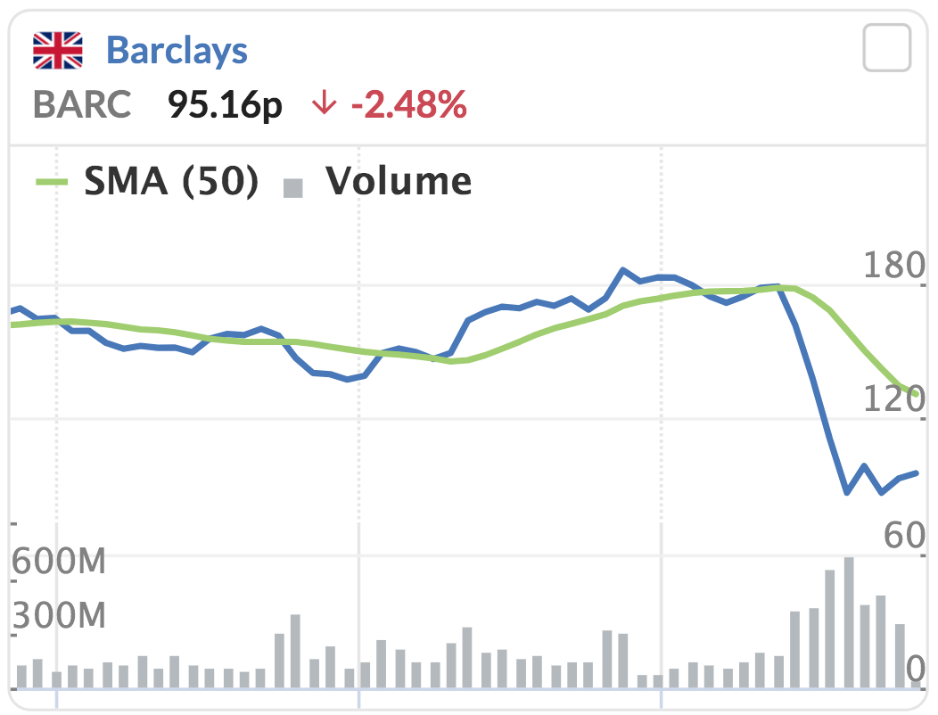
In Chart View you now get the new Mini Charts. These are fast-loading price charts for every stock on the list, but they come packed with detail...
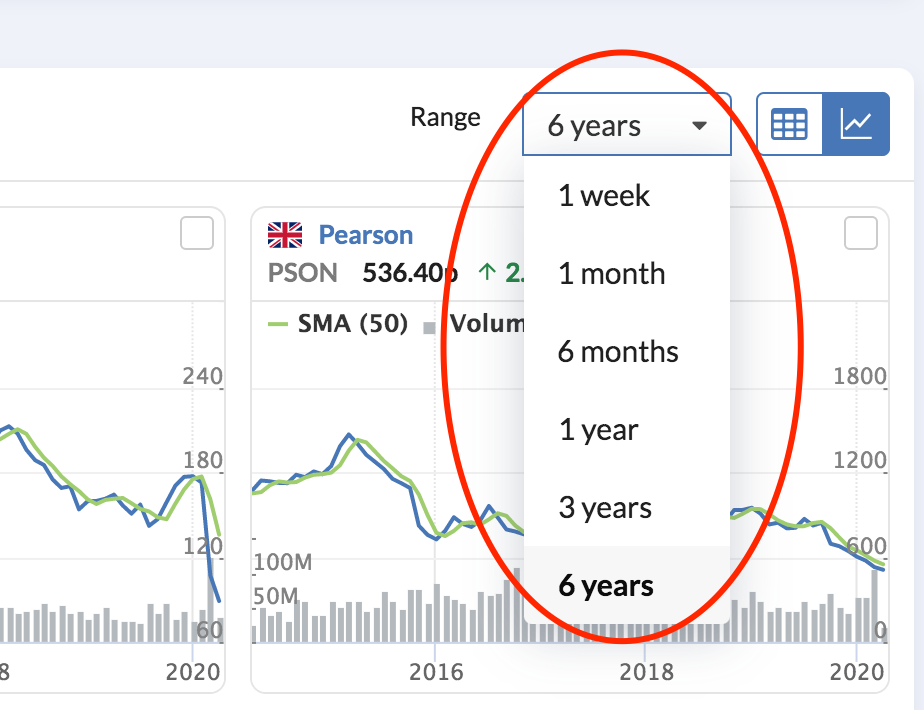
For a start, you can change the time range of your Mini Charts to anywhere between one week and six years using the Range menu at the top of the table:
In addition, each Mini Chart includes:
- The current share price and percentage price change on the previous day's close (up to 15 minutes delayed)
- The 50-Day Simple Moving Average to give an idea of the medium term technical trend in the price
- A Volume chart showing share trading volumes over the time range you have selected
- A country flag indicating where the stock is quoted
By clicking a Mini Chart you'll be taken to the stock's main price chart in the Stockopedia's Charts area.
The new Mini Charts are a big step forward from the mini charts that were previously used in the app. They are fast loading and come packed with information, making it quicker and easier to review price and momentum trends and data.
Striving for world-class design standards
Stockopedia's designers have the incredibly tough job of making sure our powerful functionality is easy to use, read and navigate. The balance between aesthetics and functionality is all the more complicated when you consider the wide ranging demands of users with different levels of experience and expectations.
Design plays a crucial part in every new feature that gets developed. But until recently there were still areas where we felt the experience of our users could be improved. They ranged from elements like colours and typography to spacing. But the good news is that a lot of that has now been fixed.
For many, these kinds of changes are barely detectable. But for others, subtle changes in colours and font sizes greatly enhance usability. And now we're fully functional across devices from desktops to mobiles, this is more important than ever.
What's changed?
Our designers have set their standards high by aspiring to the demanding guidelines set by the World Wide Web Consortium (W3C), which is led by the web's inventor, Tim Berners-Lee. Design is just one part of the protocols and guidelines that W3C has drawn up. But nonetheless, they are very exacting.
For Stockopedia, there is now a lot more alignment in the use of typefaces and font sizes, which means you get a more consistent experience.
Font sizes have been generally increased across the platform, particularly in Stock Reports and in Tables. Improved font rendering also means that the site is now easier to read.
Importantly, the colour palette across Stockopedia has also been rationalised. It was here that the designers faced their biggest challenge.
The contrast between background colours and font colours can make a huge difference to some users, so this was a key concern. W3C actually score these kinds of contrasts, and their success criterion demand that text and images of text should have a contrast ratio of at least 4.5:1. Previously, we hadn't always managed that.
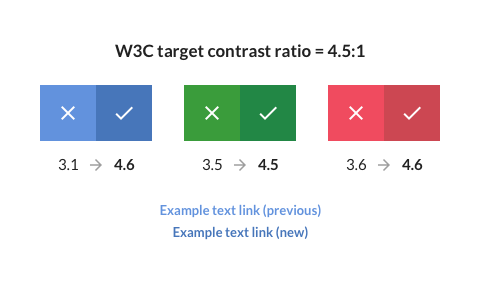
Given that very subtle changes can have a huge impact, this took a long time to get right. But we've now introduced improvements in our standard brand colours, as well as site colours you find in places like StockRanks, Stock Reports, Tables and positive and negative values (greens and reds). Contrast and legibility has improved and we're now meeting W3C standards in those areas.
Another sensitive issue has been 'information density'. A general trend across the web towards employing lots of white space seems to delight and annoy people in equal measure. As a data platform, this is a crucial issue for Stockopedia. Depending on experience, having lots of information packed into a small space (to reduce the need for endless scrolling) can be a delight or a deterrent. So improvements have been made here to strike the right balance.
Overall, the new design improvements are just the latest in what is continuous evolution. Balancing the requirements of everyone and delivering powerful functionality that's a joy to use is a non-stop job.
What's New?
Automatic updates
When we launched the new Stockopedia last year, we introduced an update banner to the platform to invite users to try it out. At the time we were just starting the process of regularly releasing new updates and improvements. Since then, the rate of these updates has increased, but that itself has caused some frustrations.
Previously, every new update triggered a message to reload Stockopedia, which was potentially annoying. To solve this, we've introduced changes that mean from now on you'll only be notified of major enhancements. Meanwhile, our constant flow of regular platform improvements will take place in the background without you having to do anything.